What Is a Metric, in Monitoring Terms?
A ground-up tour of the “numbers with names and timestamps” that power every green graph and red alert you have ever looked at — from counters, gauges, histograms, and summaries, through push vs pull collection and time-series databases, all the way to cardinality control, SLO burn rates, and metrics-driven autoscaling in a microservices fleet.
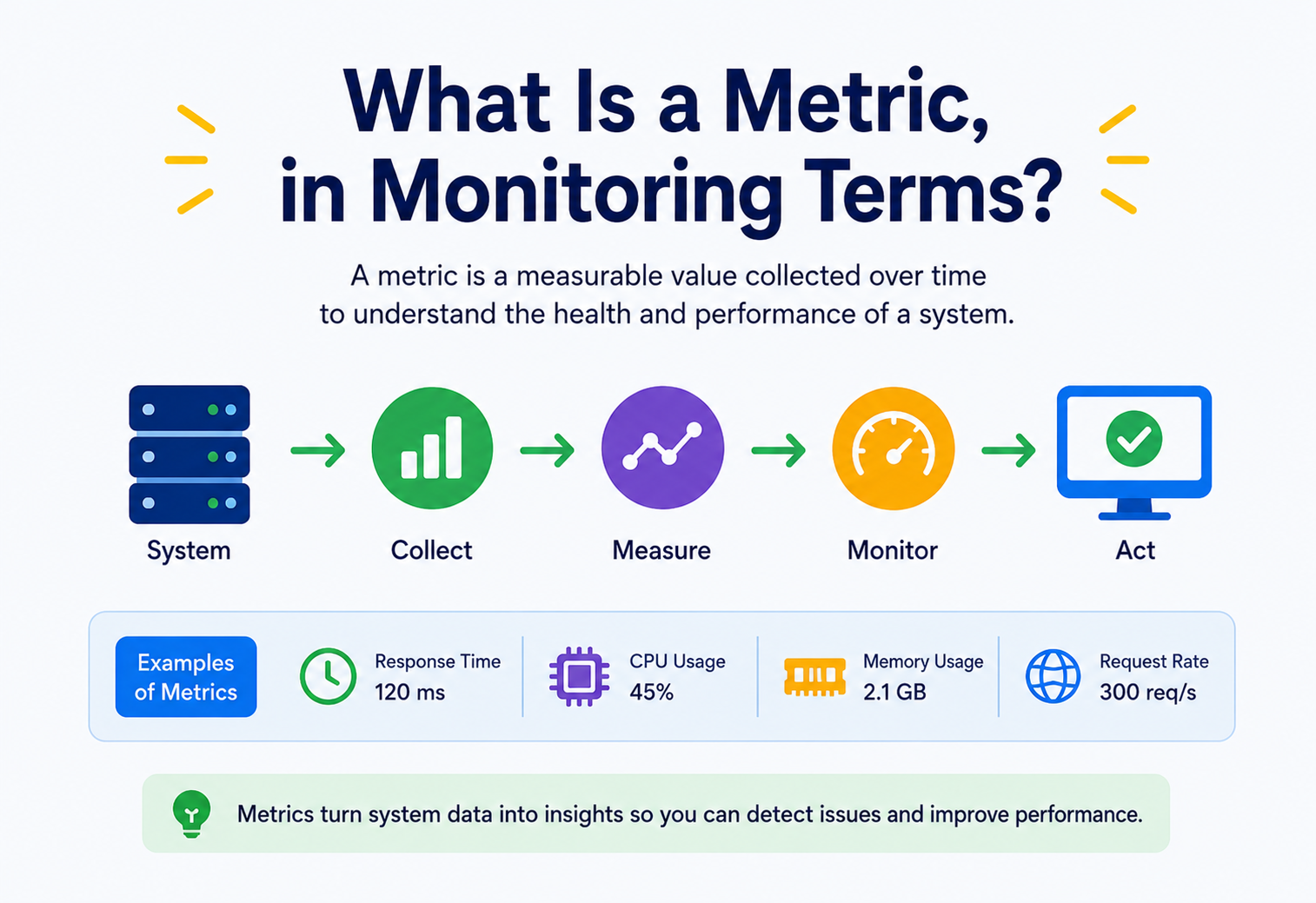
In monitoring terms, a metric is a numeric measurement of some aspect of a system, captured at a point in time, that can be aggregated and analysed over time to understand how that system is behaving. This guide walks the topic end to end — types, collection models, storage, querying, alerting, scale, and real-world usage — with concrete Micrometer and PromQL examples throughout.
Introduction & History
From SNMP polling and mainframe dials to Prometheus, OpenTelemetry, and dashboards on every engineer's second monitor.
If you have ever looked at a dashboard showing a green line going up and to the right, or a red alert that says CPU usage > 90%, you were looking at a metric. In monitoring terms, a metric is a numeric measurement of some aspect of a system, captured at a point in time, that can be aggregated and analysed over time to understand how that system is behaving.
That sounds simple, and at its core it is — a metric is “just a number with a name and a timestamp.” But the way metrics are generated, transported, stored, queried, and acted upon is one of the foundational engineering disciplines behind every reliable piece of software you use today, from a food-delivery app tracking driver locations to a bank processing millions of transactions per second.
1.1 · A SHORT HISTORY OF MEASURING SYSTEMS
The idea of measuring a running system is almost as old as computing itself. Early mainframe operators in the 1960s and 1970s watched physical dials and printed batch reports showing CPU utilisation and job queue lengths. As systems became networked, tools like SNMP (Simple Network Management Protocol), standardised in 1988, let network engineers poll routers and switches for counters such as bytes transmitted or packet errors.
The 1990s and 2000s brought tools like MRTG and Cacti, which polled devices and drew the now-familiar time-series graphs. Nagios, released in 1999, popularised threshold-based alerting — “tell me when something crosses a line.” Graphite, created at Orbitz in 2006, introduced a purpose-built time-series database and a simple text protocol that let any application push a metric with one line of code.
The real turning point came from Google's internal monitoring system, Borgmon, described publicly in the 2016 Site Reliability Engineering book. Borgmon introduced the idea of pulling metrics from applications on a schedule (“scrape-based” collection) rather than having every application push its own data — a model that directly inspired Prometheus, open-sourced by SoundCloud in 2012 and now the de-facto standard for cloud-native metrics collection, maintained today under the Cloud Native Computing Foundation (CNCF).
Alongside Prometheus, commercial and cloud-native platforms — Datadog (2010), New Relic (2008), AWS CloudWatch (2009), Grafana (2014, originally a visualisation layer for Graphite), and the OpenTelemetry project (2019, a CNCF merger of OpenTracing and OpenCensus) — have shaped the modern metrics ecosystem, aiming for vendor-neutral instrumentation that emits metrics, logs, and traces together.
Every modern system — a monolith, a microservices mesh, a serverless function, a Kubernetes cluster — needs metrics to answer one deceptively simple question: “Is this system healthy right now, and will it still be healthy in an hour?” Metrics are the primary language used to answer that question at scale.
The Problem & Motivation
Why “print statements and grep” stops working the moment you have more than one server — and what metrics buy you instead.
Imagine you run an e-commerce checkout service. On a normal day it handles 500 requests per second. One morning, customers start complaining that checkout is slow. Without any measurement in place, you are debugging blind — you would have to guess whether the database is slow, the network is congested, a downstream payment API is failing, or the service simply ran out of memory.
2.1 · THE CORE PROBLEM METRICS SOLVE
Software systems are largely invisible. You cannot see CPU cycles, network packets, or garbage-collection pauses with your eyes. Metrics convert invisible internal system behaviour into visible, comparable numbers, so humans and machines can reason about system health without reading source code or attaching a debugger to a live production process.
What is happening right now
Metrics answer “what is happening right now” — request rate, error rate, latency, queue depth — without needing to log into a server.
Intervene before the outage
A rising error rate or a memory graph trending upward lets teams intervene before a full outage, not just after.
Plan months ahead
Historical metric trends tell you when to add servers, scale a database, or renegotiate a cloud budget — months in advance.
2.2 · BEGINNER EXAMPLE
Think of a simple counter in a mobile game: players_online. Every time a player logs in, the counter increases by one; every time they log out, it decreases. A developer watching this number over a day can tell when the game is most popular (evenings, weekends) and when server load will be highest.
2.3 · REAL-WORLD EXAMPLE
A large ride-hailing company like Uber needs to know, at every moment, how many drivers are online in every city, how many ride requests are being matched per second, and how long the average match takes. If the “match latency” metric climbs from 2 seconds to 20 seconds in Mumbai, engineers are alerted and can investigate before thousands of riders experience a bad app-opening moment.
Real-life analogy — the car dashboard
A metric is like the dashboard in your car. You don't need to open the engine to know your speed, fuel level, or engine temperature — a handful of well-chosen numbers, updated continuously, tell you everything you need to drive safely. Monitoring a software system without metrics is like driving with the dashboard covered by tape.
2.4 · WHY NOT JUST USE LOGS?
A reasonable question: why not simply write a log line every time something happens and grep through it later? The answer is cost and speed. Logs are text-heavy, expensive to store at high volume, and slow to aggregate (“how many errors happened per second, averaged over the last 5 minutes, across 300 servers?” is a very expensive question to answer from raw text logs). Metrics are pre-aggregated numbers, designed from the start to answer exactly that kind of question cheaply and instantly.
Core Concepts
Names, labels, time series, cardinality — and the four fundamental metric types that every platform builds on.
3.1 · THE FORMAL DEFINITION
A metric is a numeric representation of a measurement, sampled or aggregated over a time interval, tagged with a name and a set of key-value labels (or dimensions) that describe what was measured. Formally, a single metric data point is often represented as:
metric_name{label1="value1", label2="value2"} = numeric_value @ timestampFor example:
http_requests_total{service="checkout", method="POST", status="500"} = 42 @ 1753000000This single line tells you: the checkout service received 42 POST requests that resulted in HTTP status 500, as measured at a specific Unix timestamp. When you collect this value repeatedly over time, you get a time series — a sequence of (timestamp, value) pairs for one unique combination of metric name and labels.
3.2 · THE FOUR (OR FIVE) FUNDAMENTAL METRIC TYPES
Almost every monitoring system, from Prometheus to CloudWatch to Datadog, builds on a small number of primitive metric types. Understanding these deeply is the single most important thing to learn about metrics.
| Type | What it measures | Behaviour | Beginner example |
|---|---|---|---|
| Counter | A cumulative value that only increases (or resets to zero on restart) | Monotonically increasing | Total number of website visits since the server started |
| Gauge | A value that can go up or down | Arbitrary movement | Current temperature, current memory usage, players online |
| Histogram | Distribution of values, bucketed into ranges | Counts + sum per bucket | Distribution of API response times (0-10ms, 10-50ms, 50-200ms…) |
| Summary | Similar to histogram but computes quantiles client-side | Pre-calculated percentiles | p50/p95/p99 response time computed on the app server itself |
| Meter / Rate (derived) | Rate of change of a counter over time | Derived, not stored raw | Requests per second, computed from a counter |
A counter (like http_requests_total) never decreases — it only resets to zero if the process restarts. This design choice matters: monitoring systems can detect a restart from a sudden drop and automatically handle it when computing rates, without a human intervening.
3.2.1 · BEGINNER EXAMPLE — COUNTER vs GAUGE
Picture a coffee shop's ordering system. The number “total coffees sold today” only ever climbs upward as the day goes on — that's a counter. The number “customers currently waiting in line” goes up when someone joins the queue and down when they're served — that's a gauge. If you tried to model “customers in line” as a counter, your dashboard would show it perpetually climbing even as the shop empties out, which is meaningless. Choosing the right metric type for the right kind of quantity is one of the first judgment calls every engineer learns to make.
3.2.2 · SOFTWARE EXAMPLE — A HISTOGRAM IN PLAIN TERMS
Suppose a checkout endpoint serves 1,000 requests in a minute. A gauge could only tell you the latency of the very last request. A histogram instead tells you the whole shape of the distribution: maybe 800 requests finished in under 100ms, 150 finished between 100ms and 500ms, and 50 took over a second. That shape is far more useful for spotting a “long tail” of slow requests than a single average number, which can hide serious problems — a classic case being an average that looks fine at 200ms while 5% of real users are suffering 5-second page loads.
3.2.3 · PRODUCTION EXAMPLE — SUMMARIES AT NETFLIX SCALE
A large streaming company serving playback requests across thousands of container instances typically avoids client-side summaries for percentile calculation, because a p99 computed independently on each of 3,000 containers cannot be mathematically combined into a single global p99 afterwards. Instead, they export histogram buckets from every instance and compute the true aggregate percentile centrally, at query time, across the combined bucket counts from all instances — a subtlety that trips up many teams the first time they try to build a global “p99 latency” dashboard.
3.3 · METRIC NAME, LABELS, AND CARDINALITY
Every metric has a name (what is being measured, e.g. http_request_duration_seconds) and a set of labels (dimensions that let you slice the data, e.g. service, endpoint, status_code, region). The combination of a metric name and one specific set of label values is called a time series.
Cardinality is the number of unique time series a metric produces. If status_code has 5 possible values and endpoint has 40 possible values, that single metric name already produces up to 200 unique time series. Adding a label like user_id (potentially millions of unique values) would explode cardinality and can crash a metrics backend — this is one of the most common production incidents in monitoring systems, discussed further in the Best Practices section.
3.4 · METRICS vs LOGS vs TRACES — THE THREE PILLARS
Numeric, aggregated, cheap
Numeric, aggregated, cheap to store long-term. Answer “how much / how many / how fast, over time.” Best for dashboards and alerting.
Discrete text events
Discrete, timestamped text events with rich context. Answer “what exactly happened at this moment.” Best for debugging a specific incident.
One request's journey
A record of a single request's journey across multiple services. Answer “where did time go for this one request.” Best for finding bottlenecks in distributed calls.
These three are complementary, not competing. A well-instrumented production system uses a metric to detect that something is wrong (e.g. error rate spiked), a trace to find which service in the chain is failing, and a log to see the exact error message and stack trace from that service.
3.5 · PUSH vs PULL COLLECTION MODELS
There are two fundamental ways metrics get from an application into a monitoring system:
- Push model: The application actively sends (“pushes”) metric values to a collector, typically over UDP or HTTP. StatsD and Graphite popularised this model. Good for short-lived jobs (like a batch script) that won't be alive when a collector wants to poll them.
- Pull model: The application exposes an HTTP endpoint (commonly
/metrics) listing its current metric values in plain text; a central server (like Prometheus) fetches (“scrapes”) this endpoint on a fixed schedule, e.g. every 15 seconds. This makes it trivial to see if a target is down (the scrape simply fails) and centralises configuration of “how often do we collect.”
3.6 · SOFTWARE EXAMPLE — INSTRUMENTING A JAVA SERVICE
Here is a minimal example using Micrometer, the standard metrics facade used inside Spring Boot applications, which can export to Prometheus, CloudWatch, Datadog, and others without changing application code.
@RestController
public class CheckoutController {

    private final Counter checkoutCounter;
    private final Timer   checkoutTimer;

    public CheckoutController(MeterRegistry registry) {
        // Counter: total checkouts attempted, tagged by outcome
        this.checkoutCounter = Counter.builder("checkout.attempts")
                .description("Total number of checkout attempts")
                .tag("service", "checkout")
                .register(registry);

        // Timer: records both a count AND a latency histogram
        this.checkoutTimer = Timer.builder("checkout.duration")
                .description("Time taken to complete checkout")
                .publishPercentileHistogram()
                .register(registry);
    }

    @PostMapping("/checkout")
    public ResponseEntity<String> checkout(@RequestBody Order order) {
        return checkoutTimer.record(() -> {
            checkoutCounter.increment();
            try {
                orderService.process(order);
                return ResponseEntity.ok("Order placed");
            } catch (PaymentFailedException e) {
                checkoutCounter.increment(); // still counts as an attempt
                return ResponseEntity.status(402).body("Payment failed");
            }
        });
    }
}
With Spring Boot Actuator and Micrometer wired up, this single block of code automatically exposes a /actuator/prometheus endpoint containing lines such as:
# HELP checkout_attempts_total Total number of checkout attempts
# TYPE checkout_attempts_total counter
checkout_attempts_total{service="checkout",} 1523.0

# HELP checkout_duration_seconds Time taken to complete checkout
# TYPE checkout_duration_seconds histogram
checkout_duration_seconds_bucket{le="0.1",} 980.0
checkout_duration_seconds_bucket{le="0.5",} 1490.0
checkout_duration_seconds_bucket{le="+Inf",} 1523.0
checkout_duration_seconds_sum 214.7
checkout_duration_seconds_count 1523.0
Architecture & Components
Five layers — instrumentation, collection, storage, query, visualisation — sit under every metrics product, open source or SaaS.
A production metrics pipeline is a distributed system in its own right. It typically has five layers, whether you are using open-source tools or a commercial SaaS platform.
4.1 · INSTRUMENTATION LAYER
Client libraries embedded in application code (Micrometer for Java, prometheus-client for Python, the OpenTelemetry SDK) create and update counters, gauges, and histograms in memory as the application runs.
4.2 · COLLECTION / TRANSPORT LAYER
Agents (Prometheus server, the OpenTelemetry Collector, a StatsD daemon, CloudWatch Agent) are responsible for getting metric values off the application host and onto the network — either by scraping an HTTP endpoint or receiving pushed UDP/HTTP packets.
4.3 · STORAGE LAYER — THE TIME-SERIES DATABASE (TSDB)
Metrics are stored in a specialised database optimised for append-only, timestamp-ordered numeric data. Popular TSDBs include Prometheus's own local TSDB, InfluxDB, VictoriaMetrics, Thanos/Cortex/Mimir (for horizontally scaled, long-term Prometheus storage), and cloud-native options like Amazon Timestream or Google Cloud Monitoring's internal store.
4.4 · QUERY & ALERTING LAYER
A query language (PromQL for Prometheus, Flux for InfluxDB, MQL for CloudWatch) lets engineers ask questions like “what is the 99th percentile latency over the last hour, grouped by region?” Alerting rule engines continuously evaluate these queries and fire notifications when thresholds are crossed.
4.5 · VISUALISATION LAYER
Dashboards (Grafana being the dominant open-source choice) render time series as graphs, heatmaps, and single-value panels, giving humans an at-a-glance view of system health.
You don't need to build all five layers yourself. Managed platforms like Datadog, New Relic, or AWS CloudWatch bundle collection, storage, querying, and visualisation into one product — great for getting started quickly, at the cost of less control and, usually, higher bills at scale.
Internal Working
Atomic counters, bucketed histograms, the 15-second scrape lifecycle, and how downsampling keeps storage bounded.
5.1 · HOW A COUNTER ACTUALLY WORKS IN MEMORY
Inside an application process, a counter is typically an atomic integer (to be safe under concurrent access from multiple threads). Every time the measured event happens, the application calls increment(), which performs an atomic compare-and-swap operation so that concurrent requests don't lose increments to a race condition.
public class SimpleCounter {
    private final AtomicLong value = new AtomicLong(0);

    public void increment() {
        value.incrementAndGet(); // thread-safe, lock-free
    }

    public long get() {
        return value.get();
    }
}
5.2 · HOW HISTOGRAMS COMPUTE PERCENTILES
A histogram does not store every individual observed value (that would be far too much data). Instead, it maintains a small, fixed set of “buckets” with upper bounds, and increments a counter for every bucket whose bound is greater than or equal to the observed value. For example, with buckets [0.1, 0.5, 1, 5, +Inf], a response time of 0.3 seconds increments the 0.5, 1, 5, and +Inf bucket counters (each bucket is cumulative — it counts everything less than or equal to its bound).
To estimate the 95th percentile later, the query engine performs linear interpolation between bucket boundaries based on where the 95% mark falls among the cumulative counts. This is an approximation, not an exact value — a tradeoff for keeping memory usage constant regardless of how many requests are observed.
5.3 · THE SCRAPE LIFECYCLE (PULL MODEL)
Discover targets
Prometheus reads its configuration to find a list of “targets” (hosts + ports to scrape), often via service discovery (Kubernetes API, Consul, DNS).
Fire a scrape
Every scrape interval (commonly 15s or 30s), Prometheus issues an HTTP GET to each target's
/metricspath.Receive exposition
The target responds with a plain-text list of current metric values (the exposition format).
Parse and append
Prometheus parses the response, attaches a timestamp (the scrape time), and appends each sample to its local TSDB.
Mark up=0 on failure
If a scrape fails (timeout, connection refused), Prometheus marks the target as
up=0— itself a metric — enabling alerting on “my service stopped reporting metrics” (a strong signal something is badly wrong).
5.4 · AGGREGATION AND DOWNSAMPLING INTERNALS
Raw metrics at 15-second resolution are extremely useful for the last few hours but wasteful to keep forever — a year of 15-second data for thousands of time series is enormous. Production TSDBs perform downsampling: after a configurable retention period (e.g. 7 days), raw samples are aggregated into coarser resolution (e.g. 5-minute averages/max/min) and the original high-resolution data is deleted. This keeps storage bounded (a key scalability tradeoff explored in Section 8).
Data Flow & Lifecycle
Follow one 340ms checkout timing from a Micrometer Timer.record() call all the way to a PagerDuty page.
Tracing the full journey of a single metric value from generation to alert helps make the abstract pipeline concrete.
Generation
A user hits “Buy Now.” The checkout service's Micrometer
Timerrecords that this request took 340ms.In-memory aggregation
The value is folded into the appropriate histogram bucket counters in the process's memory — no network call happens yet.
Exposition
When Prometheus next scrapes
/actuator/prometheus(within 15 seconds), the current bucket counts are serialised as plain text.Ingestion
Prometheus parses the response and writes new samples, each tagged with the scrape timestamp, into its write-ahead log and then its TSDB blocks.
Remote write (optional)
For long-term storage or multi-cluster aggregation, Prometheus can also forward samples to a remote system like Thanos or Cortex over the
remote_writeprotocol.Rule evaluation
Every evaluation interval, Prometheus re-runs any configured alerting rules, e.g.
histogram_quantile(0.95, checkout_duration_seconds) > 1.Alert firing
If the rule's condition has been true for the configured “for” duration (to avoid flapping on a single noisy sample), an alert is sent to Alertmanager.
Notification & routing
Alertmanager deduplicates, groups, and routes the alert to the correct on-call engineer via PagerDuty, Slack, or email.
Visualisation
Independently of alerting, Grafana continuously queries the same data to render live dashboards for humans browsing at any time.
Downsampling & expiry
After the configured retention window, raw samples are compacted or deleted according to the retention policy.
Notice that steps 1–2 happen inside your application with zero network cost, while steps 3 onward are entirely the monitoring system's responsibility. This separation is why metrics are so cheap compared to logging — the expensive work (aggregation) happens once in memory, not once per raw event over the network.
Pros, Cons & Tradeoffs
The three-way tension between resolution, retention, and cost — and why cardinality is where the wheels usually come off.
Pros
- Extremely cheap to store and query compared to logs or traces at the same volume.
- Ideal for dashboards, trend analysis, and threshold-based alerting.
- Language- and framework-agnostic exposition formats (Prometheus text format, OpenMetrics).
- Enable capacity planning and SLA/SLO tracking over long time windows (months, years).
- Low-cardinality metrics scale to millions of data points per second on modest hardware.
Cons
- Loss of individual-event detail — you can't ask “show me the exact request that failed” from a metric alone.
- High-cardinality labels (like user IDs) can explode storage and crash a TSDB.
- Histograms/summaries only approximate percentiles, not exact values.
- Requires deliberate instrumentation — metrics you didn't add don't exist.
- Push-based systems can silently drop data under network pressure (UDP has no delivery guarantee).
7.1 · KEY TRADEOFF — RESOLUTION vs RETENTION vs COST
Every monitoring system faces a three-way tradeoff. You can keep 1-second resolution data, but only affordably for a short window (hours to days). You can keep years of history, but only at coarse resolution (5-minute or hourly rollups). Trying to keep fine-grained data forever is the single most common cause of monitoring infrastructure cost blowouts.
| Choice | Benefit | Cost |
|---|---|---|
| High scrape frequency (1s) | Catches short spikes, precise debugging | 10–30x more storage and network vs 15–30s |
| Long retention (1yr+ raw) | Long-term trend analysis, year-over-year comparison | Storage cost grows linearly (or faster with cardinality growth) |
| High cardinality labels | Fine-grained slicing (per-user, per-request) | Time-series count multiplies; can overwhelm TSDB memory/index |
Performance & Scalability
Federation, remote-write fan-in, sharded ingesters, and the one lever — cardinality discipline — that matters more than hardware.
At small scale, a single Prometheus server handling a few hundred thousand time series works fine on one machine. At the scale of a company like Netflix or Uber — hundreds of thousands of hosts and containers, each exposing thousands of time series — the naive single-node model breaks down. Two scaling strategies dominate.
8.1 · FEDERATION AND REMOTE-WRITE FAN-IN
Multiple Prometheus servers, each responsible for a subset of the infrastructure (e.g. one per Kubernetes cluster or per datacenter), each scrape their local targets. They then either expose an aggregated /federate endpoint for a global Prometheus to scrape, or push their data via remote_write to a horizontally-scalable long-term store such as Thanos, Cortex, or Grafana Mimir.
8.2 · HORIZONTALLY SCALED TSDBs (SHARDING BY TIME SERIES)
Systems like Cortex and Mimir shard incoming time series across many ingester nodes, typically using consistent hashing on the metric name and label set — conceptually similar to how a distributed database like Cassandra shards rows by partition key. Each shard independently handles writes and reads for its subset of time series, and a query-frontend fans a single query out across all relevant shards and merges the results.
8.3 · CARDINALITY CONTROL AS THE PRIMARY SCALING LEVER
The single biggest performance lever in metrics systems isn't hardware — it's cardinality discipline. A metrics platform ingesting 10 million active time series behaves very differently from one ingesting 100 million; memory usage for the index (mapping label sets to storage locations) grows roughly linearly with unique series count, and can degrade query performance non-linearly if not sharded well.
A single careless label — such as tagging a metric with a raw request ID or full user email address — has taken down production monitoring systems at real companies by generating millions of new unique time series in minutes. Always ask: “how many unique values can this label realistically take?” before adding it.
8.4 · WRITE-AHEAD LOGS AND CRASH RECOVERY
To avoid losing recently-scraped-but-not-yet-persisted data during a crash, TSDBs like Prometheus's own storage engine use a write-ahead log (WAL) — every incoming sample is first appended to an on-disk log before being acknowledged, similar to how relational databases guarantee durability. On restart, the WAL is replayed to rebuild in-memory state.
8.5 · BEGINNER EXAMPLE — WHY A SINGLE SERVER EVENTUALLY ISN'T ENOUGH
Imagine a small startup with 20 servers, each exposing 500 time series — 10,000 series total, comfortably handled by one Prometheus instance on a laptop-sized VM. Now imagine that startup grows to 5,000 containers across a Kubernetes fleet, each exposing 500 series: 2.5 million series. A single Prometheus process, bound by the memory of one machine, simply cannot hold the in-memory index for that many series while still scraping every 15 seconds and answering dashboard queries quickly. This is the exact growth curve that pushes companies from a single Prometheus server toward the federated or horizontally-sharded architectures described above — not a hypothetical concern, but a wall nearly every fast-growing engineering org eventually hits.
8.6 · PRODUCTION EXAMPLE — QUERY PERFORMANCE TUNING
At companies running thousands of dashboards, a naive PromQL query like rate(http_requests_total[5m]) without any label filter can force the query engine to scan every single time series matching that metric name across every service in the cluster — potentially millions of series — even though a human dashboard viewer only cares about one service. Production teams mitigate this with recording rules: pre-computed, pre-aggregated queries that run on a schedule and store their result as a new, much smaller metric, so expensive aggregations happen once centrally instead of being recomputed by every dashboard refresh from every viewer.
# Example Prometheus recording rule
groups:
  - name: checkout_aggregations
    interval: 30s
    rules:
      - record: service:checkout_requests:rate5m
        expr: sum(rate(http_requests_total{service="checkout"}[5m])) by (status)
Dashboards then query the cheap, pre-aggregated service:checkout_requests:rate5m metric directly, rather than re-scanning raw request counters on every page load — a pattern directly analogous to a materialised view in a relational database.
High Availability & Reliability
If the alerting system dies during an incident, you are flying blind exactly when you need visibility most.
Ironically, the system that tells you when everything else is broken must itself be highly available — if your monitoring system goes down during an incident, you are flying blind exactly when you need visibility most.
9.1 · REPLICATED SCRAPING
A common HA pattern runs two (or more) identical Prometheus servers scraping the exact same targets independently. If one instance crashes or its host fails, the other continues collecting data uninterrupted, and dashboards/alerts can query either (or both, deduplicating) instance.
9.2 · CONSENSUS AND REPLICATION IN LONG-TERM STORAGE
Long-term storage backends like Cortex/Mimir replicate each time series write to multiple ingesters (commonly a replication factor of 3), using a quorum-based write path conceptually related to the CAP theorem: these systems generally favour availability and partition tolerance (AP) over strict consistency — it's acceptable for a dashboard to show a metric that's a few seconds stale, but unacceptable for the whole write path to halt because one replica is slow.
9.3 · FAILURE RECOVERY PATTERNS
- Local buffering: Collector agents (like the OpenTelemetry Collector) buffer metrics in memory or on disk and retry delivery if the storage backend is temporarily unreachable, rather than dropping data immediately.
- Backoff and retry: Remote-write clients use exponential backoff when the receiving TSDB signals it is overloaded (HTTP 429), preventing a thundering-herd retry storm from making the outage worse.
- Graceful degradation: Some systems intentionally drop the least-important, highest-cardinality metrics first under extreme load, preserving critical health signals (like overall error rate) even if fine-grained debugging metrics are temporarily lost.
9.4 · ALERTING ON THE ALERTING SYSTEM
Mature setups include a completely separate, minimal “dead man's switch” — a simple external check (sometimes hosted by a third-party service, deliberately outside your own infrastructure) that verifies your monitoring pipeline itself is alive, so a total monitoring outage doesn't go unnoticed.
9.5 · BEGINNER EXAMPLE — THE DEAD MAN'S SWITCH IN PRACTICE
A simple version of a dead man's switch is a scheduled alerting rule that is always configured to fire — for example, “always true” every 5 minutes — routed to a separate, independent notification channel. If that “heartbeat” alert ever stops arriving, on-call engineers immediately know the alerting pipeline itself has broken, even though no application metric ever crossed a threshold. This inverts the usual logic (alert when something is wrong) into “alert when the reassuring signal stops,” which is a surprisingly effective safety net for the one class of failure a normal alerting rule can never catch: the failure of alerting itself.
9.6 · TESTING RELIABILITY WITH CHAOS ENGINEERING
Organisations with mature observability practices — Netflix's Chaos Monkey being the best-known example — deliberately inject failures (killing random instances, adding artificial network latency) into production or staging systems specifically to verify that metrics, alerts, and dashboards correctly detect and surface the resulting degradation. If a chaos experiment causes a real outage but no alert fires, that's treated as a bug in the monitoring system itself, not just in the application, and is fixed with the same priority as a customer-facing incident.
Security
The /metrics endpoint is production data. Treat it that way.
Metrics endpoints and dashboards are frequently overlooked from a security standpoint, but they can leak sensitive operational and even business data if left unprotected.
10.1 · COMMON RISKS
- Unauthenticated
/metricsendpoints: If exposed publicly, an attacker can learn internal service names, version numbers, request patterns, and even business metrics like order volume — useful reconnaissance for a targeted attack. - Label injection: If user-controlled input (like a URL path or header) is used directly as a metric label without validation, it can cause a cardinality explosion (a form of denial-of-service) or, in poorly built systems, injection into the query language.
- Dashboard access control: Grafana dashboards often surface business-sensitive numbers (revenue, active users, conversion rates) that need the same access controls as any internal reporting tool.
- Alert notification leakage: Alert messages sent to third-party chat tools or email can inadvertently include sensitive labels (e.g. customer identifiers) if templates aren't reviewed.
10.2 · MITIGATIONS
| Risk | Mitigation |
|---|---|
| Public metrics endpoint | Restrict via network policy/firewall; require mTLS or a bearer token between scraper and target |
| Label injection / cardinality abuse | Allow-list label values from a fixed enum; never use raw user input as a label |
| Dashboard exposure | Enforce SSO and role-based access control (RBAC) on the visualisation layer |
| Data at rest | Encrypt TSDB storage volumes; apply the same data-retention and access policies as other production data stores |
Teams often secure their application APIs carefully but leave the /metrics or /actuator/prometheus endpoint completely open “because it's just monitoring.” Treat it as production data — because it is.
Monitoring, Logging & Metrics-of-Metrics
Golden signals, RED, USE, naming conventions, and how SLIs and SLOs turn raw metrics into product-level agreements.
This section addresses a subtlety beginners often miss: how do you monitor the monitoring system itself, and what supporting practices — logging, tracing, metric naming conventions — make metrics genuinely useful in production?
11.1 · THE FOUR GOLDEN SIGNALS
Google's SRE book popularises four metrics every user-facing service should have, regardless of what it does internally:
- Latency: How long requests take (and critically, split by success vs failure — a fast error is not “good latency”).
- Traffic: How much demand the system is receiving (requests/second).
- Errors: The rate of failed requests.
- Saturation: How “full” the system is — CPU, memory, queue depth, connection pool usage.
11.2 · RED AND USE METHODS
Two popular mnemonics operationalise the golden signals for different layers of a system:
Rate · Errors · Duration
The three metrics you want for every request-handling service or endpoint.
Utilisation · Saturation · Errors
The three metrics you want for every physical or virtual resource (CPU, disk, network interface).
11.3 · METRIC NAMING CONVENTIONS
Consistent naming makes metrics usable across an entire organisation instead of just one team. A widely adopted convention (used by Prometheus and OpenMetrics) is:
<namespace>_<subsystem>_<name>_<unit>

Examples:
http_server_requests_seconds
checkout_orders_total
jvm_memory_used_bytes
db_connections_pool_active
Notice the unit is part of the name (_seconds, _bytes, _total for counters) — this avoids ambiguity when someone queries the metric months later without full context.
11.4 · SLIs, SLOs, AND ERROR BUDGETS
Metrics feed directly into Service Level Indicators (SLIs) — a metric chosen to represent user-facing quality, like “percentage of requests under 300ms.” An SLO (Service Level Objective) is a target for that SLI (e.g. “99.9% of requests under 300ms, measured over 30 days”). The gap between actual performance and the SLO is the error budget, which teams use to balance the pace of new feature releases against reliability risk.
Metrics tell you an SLO is being violated right now. Distributed tracing (via OpenTelemetry) tells you which specific service in the request path is responsible. Structured logs from that service give you the exact error and stack trace. This “detect with metrics, localise with traces, diagnose with logs” workflow is the standard incident-response pattern at most mature engineering organisations.
Deployment & Cloud
Self-hosted Prometheus + Grafana, managed CloudWatch / Cloud Monitoring / Azure Monitor, SaaS platforms, and OpenTelemetry as the neutral glue.
12.1 · SELF-HOSTED (PROMETHEUS + GRAFANA STACK)
Common in Kubernetes-native environments via the kube-prometheus-stack Helm chart, which deploys Prometheus, Alertmanager, Grafana, and pre-built dashboards together, using Kubernetes service discovery to automatically find and scrape new pods as they're deployed.
# Example: annotating a Kubernetes pod so Prometheus auto-discovers it
apiVersion: v1
kind: Pod
metadata:
  name: checkout-service
  annotations:
    prometheus.io/scrape: "true"
    prometheus.io/port: "8080"
    prometheus.io/path: "/actuator/prometheus"
12.2 · MANAGED CLOUD SERVICES
| Cloud | Native metrics service | Notes |
|---|---|---|
| AWS | CloudWatch Metrics | Automatic for most AWS resources; custom metrics via PutMetricData API; 1-minute default resolution, 1-second “high resolution” available |
| Google Cloud | Cloud Monitoring (formerly Stackdriver) | Native integration with GKE, Compute Engine; supports Prometheus-compatible ingestion |
| Azure | Azure Monitor Metrics | Platform metrics collected automatically; custom metrics via Application Insights SDK |
12.3 · SaaS OBSERVABILITY PLATFORMS
Datadog, New Relic, and Grafana Cloud offer fully managed collection, storage, and visualisation, typically billed per host or per unique time series ingested — which circles back to why cardinality control (Section 8.3) directly impacts your monthly bill on these platforms, not just performance.
12.4 · OPENTELEMETRY AS THE VENDOR-NEUTRAL LAYER
A growing best practice is to instrument applications using the OpenTelemetry SDK (vendor-neutral) and route data through the OpenTelemetry Collector, which can export the same metrics to Prometheus, Datadog, CloudWatch, or multiple backends simultaneously — avoiding vendor lock-in from instrumentation code baked into every service.
Databases, Caching & Load Balancing
Why relational databases fail at metrics workloads, and how a TSDB earns its keep with columnar compression, block-based retention, and inverted label indexes.
13.1 · WHY METRICS NEED A SPECIALISED DATABASE
Relational databases are poorly suited to metrics workloads: metrics involve extremely high write volume (millions of appends per second at scale), almost no updates or deletes, and queries that scan large time ranges for a narrow set of series. Time-series databases exploit this pattern with:
- Columnar, compressed storage: Consecutive values for the same series compress extremely well (e.g. Facebook's Gorilla compression algorithm, used in Prometheus, achieves roughly 1.4 bytes per data point on typical data).
- Time-partitioned blocks: Data is organised into immutable blocks per time window (e.g. 2-hour blocks in Prometheus), making old-data deletion and compaction cheap — just drop old block files, no row-by-row deletes.
- Inverted indexes on labels: To answer “give me all series where
service=checkout,” the TSDB maintains an index mapping each label value to the set of series containing it, similar in spirit to a search-engine inverted index.
13.2 · CACHING IN THE QUERY PATH
Dashboards often re-run the same queries every few seconds for many simultaneous viewers. Query-result caching (at the query-frontend layer in systems like Cortex/Mimir/Thanos) avoids re-scanning the same time range repeatedly, dramatically reducing load on the underlying storage for popular dashboards.
13.3 · LOAD BALANCING ACROSS A METRICS CLUSTER
In a horizontally scaled deployment, incoming writes are load-balanced (often via consistent hashing, as discussed in Section 8.2) across ingester nodes so that no single node becomes a bottleneck. Reads are similarly fanned out across query nodes, with a query-frontend aggregating partial results — a pattern directly analogous to the scatter-gather approach used in distributed search and database systems.
APIs & Microservices
Every service exposes its own /metrics, autoscalers query PromQL, and service meshes emit RED signals for free.
14.1 · EXPOSING METRICS FROM A MICROSERVICE
In a microservices architecture, every service independently exposes its own /metrics endpoint. There is no central “metrics database” that services write to directly in the pull model — each service is purely passive, and the central Prometheus (or equivalent) is responsible for finding and scraping every instance, including as instances scale up and down dynamically.
14.2 · QUERYING METRICS PROGRAMMATICALLY
Beyond dashboards, metrics backends expose HTTP APIs so other systems (auto-scalers, chatops bots, CI/CD pipelines) can query them. A typical Prometheus HTTP API query:
GET /api/v1/query?query=rate(http_requests_total{service="checkout"}[5m])

Response:
{
  "status": "success",
  "data": {
    "resultType": "vector",
    "result": [
      {
        "metric": {"service": "checkout", "status": "200"},
        "value": [1753000000, "482.3"]
      }
    ]
  }
}
14.3 · METRICS-DRIVEN AUTOSCALING
Kubernetes' Horizontal Pod Autoscaler (HPA) can scale a microservice based on custom metrics (not just CPU/memory) via the Prometheus Adapter, which translates PromQL query results into the Kubernetes custom metrics API — meaning a checkout service could scale out automatically when checkout_queue_depth exceeds a threshold, rather than waiting for CPU to become the bottleneck.
14.4 · SERVICE MESHES AND AUTOMATIC INSTRUMENTATION
Service meshes like Istio or Linkerd automatically emit RED-method metrics (request rate, error rate, duration) for every service-to-service call in the mesh, without requiring each service to instrument HTTP calls manually — the sidecar proxy captures this data transparently, which is especially valuable in polyglot microservice fleets where consistent manual instrumentation across languages is hard to enforce.
Design Patterns & Anti-patterns
Symptom-based alerting, multi-window burn rates, metric-log correlation IDs — and the tempting shortcuts that create alert fatigue.
15.1 · RECOMMENDED PATTERNS
RED / USE method
Standardise on Rate/Errors/Duration for services and Utilisation/Saturation/Errors for resources so every team's dashboards are comparable.
Symptom-based alerting
Alert on user-facing symptoms (high error rate, high latency) rather than internal causes (high CPU) — a high CPU that isn't hurting users doesn't need to page anyone at 3am.
Multi-window, multi-burn-rate alerts
Combine a fast, short-window check with a slower, longer-window check for the same SLO to catch both sudden spikes and slow leaks without excessive false positives.
Metric-log correlation IDs
Include a trace/request ID as a log field (never as a metric label) so an alert on a metric can be manually correlated to specific logs during investigation.
15.2 · ANTI-PATTERNS TO AVOID
Unbounded label cardinality
Using user IDs, request IDs, raw URLs, or timestamps as label values. Use a small, bounded set of label values instead (route templates, not raw paths).
Alert fatigue
Alerting on every metric that “looks interesting” rather than on symptoms that require human action, training on-call engineers to ignore pages.
Cause-based-only alerting
Paging on “disk is 80% full” without knowing whether that actually threatens the service — better to alert on the downstream symptom and use the resource metric for diagnosis.
Silent instrumentation gaps
Assuming a new service is covered by monitoring “because it uses the same framework,” without verifying its /metrics endpoint is actually being scraped.
Best Practices & Common Mistakes
Name your metrics, budget your cardinality, alert on symptoms — and use logs, not labels, when you need per-user detail.
16.1 · BEST PRACTICES
- Name metrics consistently, including units, following an organisation-wide convention (Section 11.3).
- Instrument the four golden signals for every user-facing service before anything else.
- Treat cardinality as a budget: review new labels in code review the same way you'd review a new database index.
- Alert on SLO burn rate and user-facing symptoms, not raw resource thresholds, wherever possible.
- Keep raw high-resolution data for a short window and downsample aggressively for long-term storage.
- Version and test alerting rules the same way you test application code (Prometheus supports unit tests for rules).
- Document every dashboard panel with a short description of what “healthy” looks like for a new team member.
16.2 · WORKED EXAMPLE — FIXING A BAD METRIC
Consider a team that instruments their order-processing service like this:
// BAD: high-cardinality label from raw user input
Counter.builder("orders.processed")
    .tag("user_id", order.getUserId())      // could be millions of unique values
    .tag("order_timestamp", order.getTs())  // effectively unique every time
    .register(registry);
This single line can generate millions of unique time series within hours, because user_id and order_timestamp are both effectively unbounded. A corrected version keeps the metric name focused on what actually needs slicing:
// GOOD: bounded, meaningful labels only
Counter.builder("orders.processed")
    .tag("region", order.getRegion())         // small, fixed set of values
    .tag("payment_method", order.getMethod()) // small, fixed set of values
    .tag("status", order.getStatus())         // small, fixed set of values
    .register(registry);

// If you need to look up a specific user's specific order,
// that belongs in a LOG line with the same request/trace ID,
// not in a metric label.
log.info("Order processed orderId={} userId={} status={}",
          order.getId(), order.getUserId(), order.getStatus());
This is the practical version of the “detect with metrics, diagnose with logs” principle from Section 11.4 — the metric stays cheap and aggregatable, while the log line preserves the fine-grained detail an engineer would need during an actual investigation.
16.3 · COMMON MISTAKES
| Mistake | Why it hurts | Fix |
|---|---|---|
| Using a Summary instead of Histogram across many instances | Client-side percentiles can't be aggregated across multiple servers mathematically | Use histograms centrally aggregated, or aggregate summaries only within a single instance |
| Forgetting counter resets on restart | Naive difference calculations produce a huge negative or spike value | Always use rate()/increase() functions that detect and handle resets |
| Too many dashboards, none authoritative | On-call engineers waste critical minutes finding the right dashboard during an incident | Maintain one canonical “service health” dashboard per service, linked from the alert itself |
| No ownership of alerts | Alerts nobody acts on get silently muted, hiding real problems later | Every alert must map to a specific team/runbook; review and prune unused alerts quarterly |
Real-World / Industry Examples
Netflix Atlas, Amazon COE reviews, Google Monarch, Uber M3, and why every large bank runs its metric pipeline twice.
Atlas
Netflix built and open-sourced Atlas, an in-memory dimensional time-series database designed to handle extremely high cardinality and high write throughput across thousands of microservices, prioritising near-real-time query speed over long-term historical depth — reflecting Netflix's operational need to detect regional streaming issues within seconds, not minutes.
CloudWatch & COE culture
AWS CloudWatch underpins metrics for virtually every AWS service, and internally Amazon's own operational culture is built around metrics-driven “COE” (Correction of Error) postmortems — every significant incident review examines which metric should have caught the issue earlier and whether an alert threshold needs adjustment, closing the loop between real incidents and monitoring coverage.
Borgmon & Monarch
Google's internal Monarch and (earlier) Borgmon systems process metrics at a scale of billions of time series, directly inspiring the SRE practices — SLIs, SLOs, error budgets, the four golden signals — that are now industry standard and documented in Google's publicly available Site Reliability Engineering book.
M3
Uber's M3 (open-sourced) time-series database was built specifically to handle the extreme write volume and cardinality generated by per-city, per-driver, per-trip metrics across a globally distributed microservices fleet, using a horizontally sharded architecture similar to the pattern described in Section 8.2.
Duplicated payment-path pipelines
Large banks and payment processors treat certain metrics — transaction success rate, payment gateway latency, fraud-check duration — as regulatory and business-critical simultaneously. It's common for such organisations to run duplicated, independently alerting monitoring pipelines for their core payment path, precisely because Section 9's “your monitoring system must itself be highly available” principle is non-negotiable when every minute of undetected downtime translates directly into failed transactions and financial loss.
Every one of these companies eventually outgrew a single off-the-shelf metrics database and built or heavily customised their own — a strong signal that cardinality, write throughput, and query latency at extreme scale are genuinely hard distributed-systems problems, not just configuration tuning. For most organisations, however, the open-source Prometheus-plus-Grafana stack or a managed SaaS platform is more than sufficient, and reaching for a custom-built TSDB before you have Netflix- or Uber-scale problems is itself an anti-pattern worth avoiding.
FAQ, Summary & Key Takeaways
The recurring questions, the seven things worth memorising, and where to go next in the observability series.
Is a metric the same as a KPI?
No. A metric is a raw, low-level technical measurement (like http_requests_total). A KPI (Key Performance Indicator) is typically a business-level measure (like monthly active users or revenue) that may itself be built from one or more underlying metrics.
How often should I scrape or push metrics?
15–30 seconds is a common default for most services. Very latency-sensitive systems (payment processing, real-time bidding) might scrape every 5–10 seconds; low-priority batch jobs might only need 1–5 minute intervals.
Can I recover exact individual event data from a metric later?
No — once aggregated into a counter or histogram bucket, individual event details are gone by design. If you need per-event detail, that's what logs and traces are for; metrics and logs are complementary, not substitutes.
What's the difference between a gauge and a counter for something like “queue length”?
Queue length should always be a gauge, since it goes up and down. A common beginner mistake is modelling something as a counter when it can decrease — the monitoring system will compute nonsensical negative “rates.”
Do I need Prometheus, or can I just use print statements and grep?
For a hobby project or a single script, ad-hoc logging is fine. The moment you have more than one server, need to see trends over time, or want to be alerted automatically rather than noticing a problem manually, a proper metrics pipeline pays for itself almost immediately — even a lightweight, free, single-node Prometheus and Grafana setup is a large step up from grepping logs across multiple machines by hand.
How is a metric different from an event?
An event is a discrete occurrence with rich context, typically recorded as a structured log entry (“user 4821 completed checkout at 14:32:07 with cart value $87.20”). A metric is what you get when you count, sum, or otherwise aggregate many events into a number over a time window (“142 checkouts completed in the last minute”). Some modern systems blur this line with “exemplars” — a Prometheus and OpenTelemetry feature that attaches a sampled trace ID to a specific histogram bucket, letting you jump from an aggregated metric spike directly to one real example trace that fell into it.
Should every microservice have its own dashboard?
Generally yes, at minimum a standard RED-method dashboard generated automatically from a shared template, so that any engineer, regardless of which team built the service, can open any service's dashboard and immediately recognise the same four panels: request rate, error rate, latency percentiles, and saturation. Consistency across dashboards is often more valuable than customising each one heavily.
18.1 · SUMMARY
A metric, in monitoring terms, is a timestamped numeric measurement — typically a counter, gauge, or histogram — collected from a running system, aggregated over time, and used to power dashboards, alerts, and capacity planning. Metrics are cheap to store and query compared to logs and traces precisely because they discard individual-event detail in favour of pre-aggregated numbers, making them the right tool for answering “how much, how fast, how often” questions about a live system, while logs and traces remain the right tools for deep, per-event debugging.
18.2 · KEY TAKEAWAYS
- Metrics are numeric, labeled, timestamped measurements — the foundation of the “metrics” pillar of observability, alongside logs and traces.
- Four core types — counter, gauge, histogram, summary — cover almost every measurement need.
- Pull-based (Prometheus-style scraping) and push-based (StatsD-style) are the two dominant collection models, each with tradeoffs.
- Cardinality control is the single biggest lever for both performance and cost at scale.
- Golden signals, RED, and USE give teams a proven, standardised starting point for what to measure.
- Production-grade metrics systems apply distributed-systems principles — sharding, replication, write-ahead logs, CAP-theorem tradeoffs — just like any other large-scale data store.
- Metrics, logs, and traces work together: detect with metrics, localise with traces, diagnose with logs.
18.3 · WHERE TO GO FROM HERE
Once metrics are solid, the natural next steps are distributed tracing (to localise which service in a request path is misbehaving), structured logging (to diagnose the exact failure once you've localised it), and building effective SLOs and error budgets on top of the metrics foundation covered here. None of this needs to be learned all at once; the core mental model — a small number of well-named, bounded-cardinality time series feeding dashboards and symptom-based alerts — will carry you through almost every real-world integration you're likely to build.