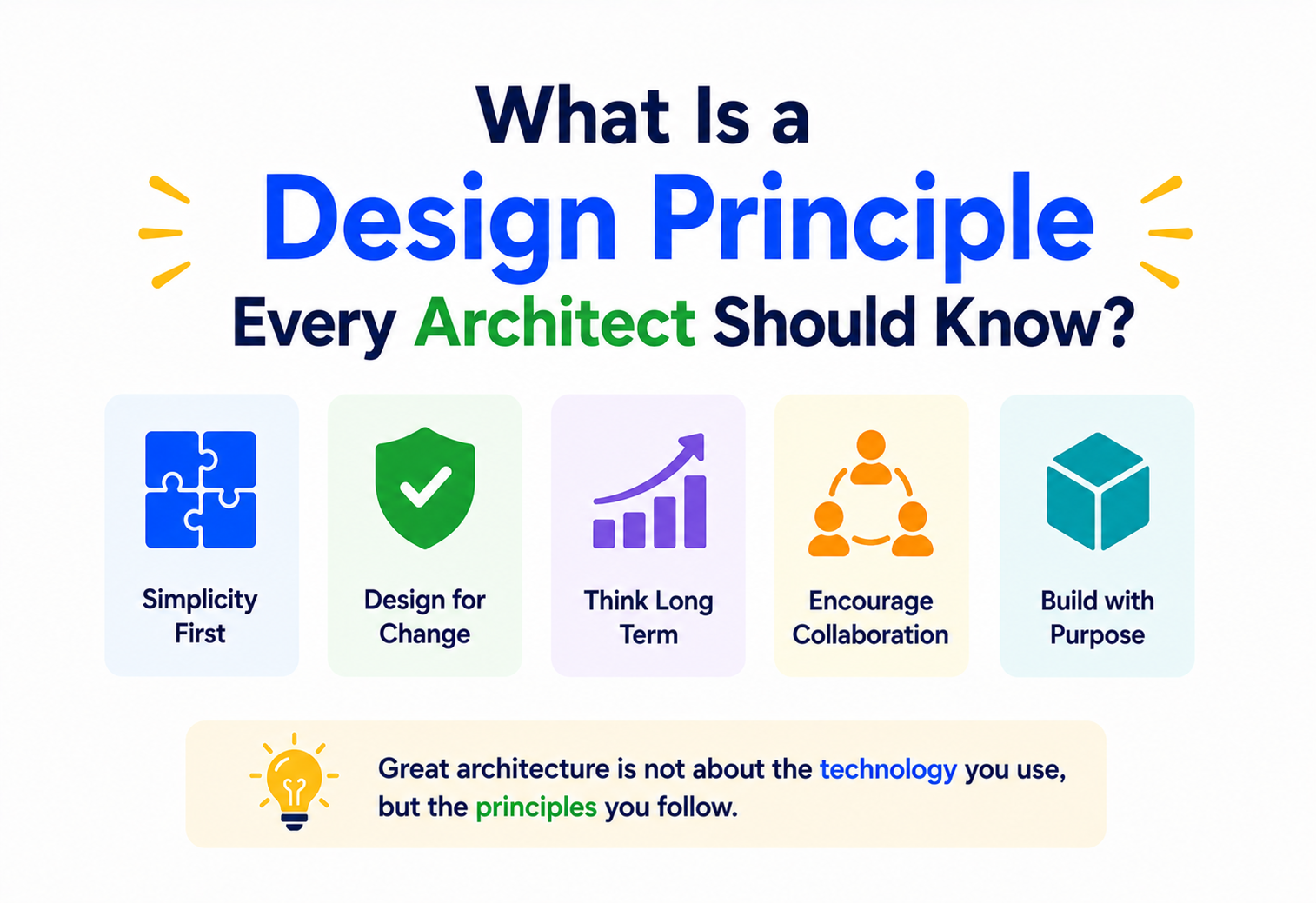
What Is a Design Principle Every Architect Should Know?
Long before software existed, people were designing complex things that had to stand up, work well, and feel right — buildings. The rules they discovered along the way are the same ones a good software architect leans on today, just wearing different clothes.
The Big Idea, in One Breath
Two very different people at work — one designing a building, one designing an app — quietly ask the exact same questions. Design principles are the answers.
Picture two very different people at work: one is standing in front of an empty plot of land, sketching where the walls, windows, and staircases of a new building should go. The other is sitting in front of a blank screen, sketching where the databases, services, and user screens of a new application should go. On the surface, nothing about their jobs looks alike. But peel back one layer, and both are quietly asking the exact same questions: what should stand out, what should repeat, what should feel balanced, and what should never be allowed to get too big or too messy?
Those shared questions are answered by a small set of ideas called design principles — timeless rules of thumb that have guided builders of complicated things for thousands of years, long before the word “software” ever existed. Because these principles were discovered by watching what makes physical buildings work, feel good, and last, they carry a kind of hard-won wisdom that software architecture happily borrows today.
That borrowing is not accidental. The very word “architect” was itself imported from the world of construction into the world of computing precisely because early software builders recognised the resemblance. If a discipline has been quietly solving similar problems for two thousand years, only a bold beginner would refuse to listen to its answers.

Think about your favourite public library. There is usually one grand entrance you notice first (not five confusing doors), the bookshelves repeat in a steady, predictable rhythm down each aisle, and the whole building feels like it belongs together, inside and out. A well-designed piece of software gives you that exact same feeling: one clear way in, a rhythm you can predict, and a sense that all the pieces belong to the same family.
What a Design Principle Really Is
Not a strict rule with one right answer. A guiding habit of thought — a lens for decisions nobody could fully plan for in advance.
A design principle is not a strict rule with only one right answer, like a maths formula. It is closer to a guiding habit of thought — a lens that helps someone make good decisions in situations nobody could fully plan for in advance. Architecture principles get applied over and over, on every single project, precisely because they do not tell you exactly what to build; they tell you what to keep asking yourself while you build it.
This is exactly why the same handful of principles appear again and again, whether you flip through a book about grand cathedrals or a handbook for enterprise software teams. A principle like “keep things balanced” does not care whether “things” means the left and right wings of a museum or the workload spread across ten servers. The principle is the same; only the material changes.
“What is a design principle?” is really asking for a short, memorable piece of advice that has been proven true across hundreds of projects, meant to steer a decision rather than dictate it.
Why They Matter So Much
Without shared principles, every decision has to be argued from scratch. With them, teams have a common language and a shared set of default answers.
Without shared principles, every single decision on a project has to be argued from scratch, by instinct alone, and two equally smart people can easily land on opposite answers. Principles give a team — whether they are pouring concrete or writing code — a common language and a common set of default answers to fall back on.
A tie-breaker on demand
When two options both seem reasonable, a principle like “keep it simple” or “let form follow function” gives the team an honest way to choose without endless meetings.
One shared feel
Every room in a building, or every screen in an app, ends up feeling like it belongs to the same family, even when different people built different parts.
Learned the hard way, once
Most principles exist because someone, somewhere, built something without them — and paid for it later with a structure that did not quite work.
A shortcut to shared understanding
A new team member who understands the guiding principles can predict how the rest of the project will likely be organised long before reading every file.
The next several sections walk through the principles that show up most often, always starting from their original home in physical buildings — because that is where the intuition is easiest to picture — and then following each one across into the world of software architecture, where it turns out to be doing the exact same job.

Symmetry and Its Rebellious Cousin
Balance distributes weight so nothing feels about to tip over. Two well-known ways to achieve it — symmetry and asymmetry — both keep everything settled.
Balance is about how the weight of a design is distributed, so nothing feels like it is about to tip over — visually or structurally. There are two well-known ways to achieve it. Symmetry mirrors elements around a central line, like a grand government building with identical wings on either side of the front steps. Asymmetry achieves the same steady, settled feeling without any mirroring at all — a large, heavy shape on one side is quietly offset by several smaller, lighter shapes on the other, the way a see-saw can balance one heavy child against two lighter ones sitting further out.
Software carries this exact idea into how work is spread across a system. A load balancer, for instance, aims for symmetry — sending an equal share of traffic to a row of identical servers, just like a mirrored facade. But real systems are rarely that tidy: sometimes one heavyweight service needs to be counter-balanced by several lighter, specialised services handling smaller jobs around it, the architectural equivalent of asymmetry. Either way, the goal is the same — no single part should be left straining under more weight than it can comfortably hold.
Emphasis and Hierarchy
Deciding, on purpose, what a person’s eyes should land on first. If everything is emphasised, nothing actually is.
Emphasis is about deciding, on purpose, what a person’s eyes should land on first. A grand entrance is taller, brighter, or more decorated than the rest of the wall around it specifically so a visitor never has to wonder where to walk in. Without emphasis, every part of a design shouts for attention at once — which really means nothing gets heard at all.
Software needs its own version of a “front door” too. A well-organised system makes it obvious which service or screen is the true starting point, and which parts are supporting detail meant to stay quietly in the background. A tidy homepage draws your eye straight to the one button that matters — “Start Free Trial” — rather than surrounding it with ten equally loud competing options. A tidy backend does the same thing for other engineers: one clearly documented entry-point API, rather than forty unofficial ways to reach the same data.

If everything in a design is emphasised, nothing actually is. Good emphasis means choosing — deliberately, painfully sometimes — what gets to be the star of the page, or the star of the system.
Proportion and Scale
A doorway a metre wide feels welcoming; a doorway thirty centimetres wide feels absurd. Software has to respect scale too — measured in responsibility rather than centimetres.
Proportion compares the size of one part of a design to another — and, very importantly, to the size of the human being who will actually use it. A doorway that is a metre wide feels welcoming; the same doorway shrunk to thirty centimetres would feel absurd, no matter how beautifully it was decorated, because it no longer respects the scale of the person walking through it.
Software has to respect scale too, just measured in a different unit — responsibility instead of centimetres. A single service that tries to handle logins, payments, notifications, reporting, and search all at once has broken proportion just as surely as a doorway sized for a giant. It has grown so large relative to what a team can realistically understand and maintain that it starts to work against the very people meant to use it. Good proportion in software usually means giving each part of a system a size that a single small team can hold comfortably in their heads — no larger, no smaller than that job actually requires.
What each part is built to do
A well-proportioned service does one thing well and hands the rest to neighbours built for those jobs.
Who can fully hold it
A single small team should be able to keep the whole thing in their heads without a wiki open on the second screen.
Reasons to become “everything”
Any service quietly becoming the place where every new feature lands is a warning sign, not a milestone.
Rhythm and Repetition
Predictable repetition is called rhythm. It is part of why enormous buildings still feel calm — and one of the most directly borrowed principles in all of software.
Walk along the front of almost any grand old building and you will notice the windows are not placed randomly — they repeat, evenly spaced, column after column, creating a steady visual beat, the same way a drum keeps time through a song. That predictable repetition is called rhythm, and it is part of why a building can feel calm and orderly even though it is enormous.
This is one of the most directly borrowed principles in all of software. Engineers call it consistency, or reusable patterns, but it is rhythm wearing a different name. A codebase where every service follows the same layout, every API answers errors the same way, and every screen uses the same button style is a codebase with rhythm — and just like the building, that predictability is what lets people move through it comfortably instead of tripping over surprises at every turn.

Unity and the Datum
Every piece belongs to the same family. A datum — one fixed reference point — is often the trick that makes it feel that way.
Unity means every individual piece feels like it belongs to the same overall family — same materials, same visual language, same underlying logic — even though a building might be made of thousands of separate parts. Architects often achieve this with the help of a datum: one fixed, central reference point that everything else quietly lines up around, the way every path in a park might curve gently toward one central fountain.
Software systems need a datum of their own too — a single source of truth that every other part agrees to reference rather than keeping its own competing copy. It might be one canonical customer database that every other service checks against, or one shared design system that every screen pulls its colours and fonts from. Without that anchor point, different parts of a system slowly drift apart, the digital version of a building where the east wing was built to completely different measurements than the west wing.
Think of a school timetable pinned up in the main hallway. Every teacher, every student, every classroom schedule ultimately checks against that one master copy. If each classroom kept its own separate version, chaos would follow within a week. That pinned master timetable is a datum — and a shared “source of truth” database plays exactly the same role inside a piece of software.
Simplicity and Function
Form follows function. The shape of something should grow naturally out of the job it needs to do — not be decided first and forced to work later.
One of the oldest sayings in architecture is “form follows function” — meaning the shape of something should grow naturally out of the job it needs to do, rather than being decided first and forced to work later. A staircase is not beautiful because someone drew a pretty curve; it is beautiful because that curve happens to be exactly the shape that makes climbing it feel effortless.
| Principle | In a Building | In a Software System |
|---|---|---|
| Function first | A hospital corridor is wide enough for two stretchers to pass, because that is what it must do. | An API is shaped around what callers actually need to do, not around how the database happens to be organised. |
| Remove the unnecessary | Ornamentation that does not serve a purpose is usually the first thing cut when budgets tighten. | Unused features and dead code quietly become the biggest source of confusion and bugs over time. |
| Clarity over cleverness | A confusing floor plan looks impressive on paper but frustrates everyone who has to live in it daily. | A clever, tangled piece of code impresses nobody once someone else has to maintain it at 2 a.m. |
Simplicity does not mean “boring” or “basic” — some of the most admired buildings and systems in the world are strikingly simple precisely because every unnecessary element was deliberately stripped away, leaving only what truly earns its place.

A Side-by-Side Example
A small public library and a small online bookstore look nothing alike on the surface. Underneath, the same handful of quiet decisions shape both.
Let us put several of these principles to work at once, comparing a small public library building with a small online bookstore application — two very different things, built using the very same underlying thinking.
Library: one grand entrance
A tall, well-lit doorway makes it obvious where to walk in, instead of five confusing side doors competing for attention.
App: one clear “Buy Now”
A single prominent button guides the shopper, instead of scattering ten equally loud calls to action across the screen.
Library: repeating shelves
Each aisle uses the same spacing and signage, so a visitor instantly understands a new aisle without relearning anything.
App: consistent product cards
Every book listing follows the identical layout, so shoppers can scan the page quickly without re-reading instructions.
Library: the catalogue desk
Every visitor and every librarian ultimately checks the same master catalogue to know what is true.
App: one inventory database
Every screen — search, cart, checkout — pulls stock numbers from the same single source, so nothing ever disagrees with itself.
Neither the library nor the app looks anything like the other on the surface. But both were shaped by the exact same handful of quiet decisions — and both would fall apart in familiar ways if those decisions had been skipped.
Common Pitfalls
Followed blindly, principles curdle into habits. Followed thoughtfully, they stay useful.

Treating Principles as Rigid Rules
The moment a principle is followed blindly, without asking whether it actually fits the situation at hand, it stops being useful guidance and starts being a straitjacket. A famous open-plan museum and a famous cosy chapel can both be considered great architecture, even though one leans hard into openness and the other into intimacy — because the “right” application of a principle always depends on context.
Chasing Style Over Substance
It is tempting to copy the look of a well-known design without understanding the reasoning underneath it — repeating a shape because it looks fashionable, rather than because it actually serves the people using the space. Software falls into the exact same trap when a team adopts a trendy pattern purely because a well-known company uses it, without checking whether their own situation calls for it at all.
Ignoring the People Who Actually Use It
A building can be stunning in photographs and still fail the people walking through its doors every day if their real needs were never truly considered. A system can look elegant in a design document and still frustrate the engineers and customers who actually depend on it. Every principle discussed above exists in service of real people — the moment that gets forgotten, the principle has lost its purpose.
Any decision defended with “because that is just how it is always done,” rather than a real reason tied to the people or the problem at hand. That is usually a sign a principle has curdled into a habit nobody is questioning anymore.
Key Takeaways
A six-line summary you can keep next to your monitor.
Remember this
- Design principles are guiding habits of thought, not rigid rules — they steer decisions rather than dictate a single right answer.
- Balance, emphasis, proportion, rhythm, unity, and simplicity were first discovered through centuries of building physical structures, and they translate directly into software architecture.
- Balance spreads weight evenly; emphasis chooses a clear focal point; proportion keeps every part sized to what people can actually handle.
- Rhythm builds trust through repetition; unity and a shared datum keep every part of a system pointed at the same truth; simplicity keeps form honestly tied to function.
- Principles only work when applied thoughtfully to real context — followed blindly, they turn from wisdom into a straitjacket.
- Whether the material is concrete or code, the underlying questions a good architect asks never really change.