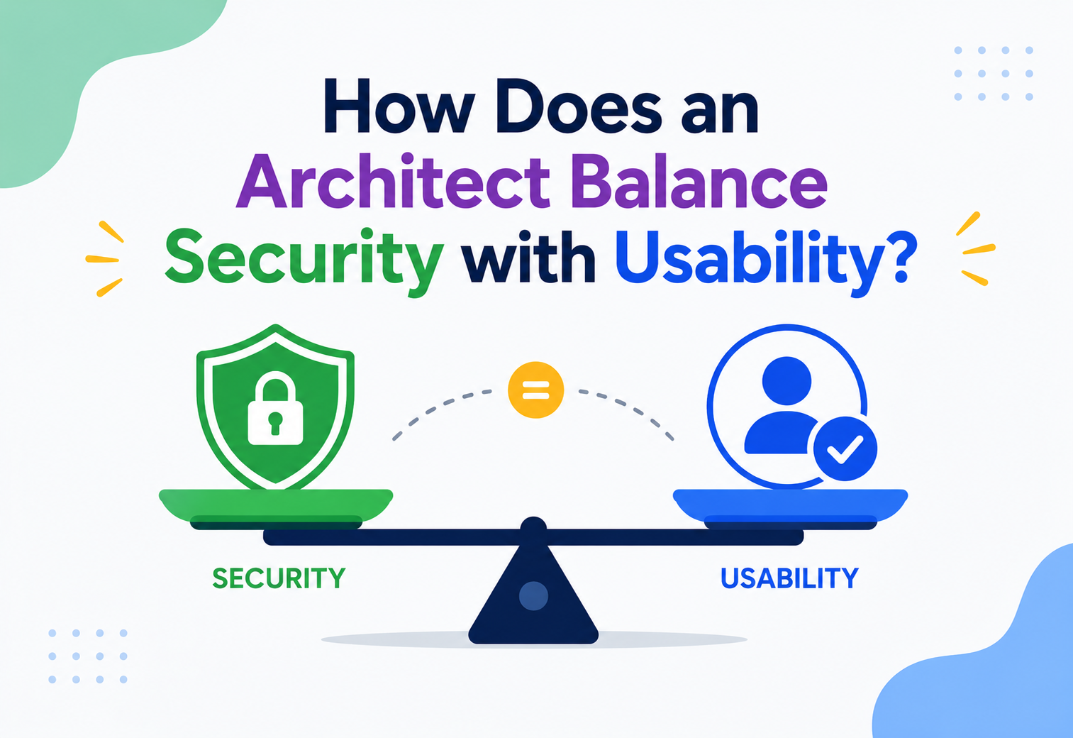
How Does an Architect Balance Security With Usability?
A complete, beginner-to-production guide to the oldest tension in software design: the more you lock a system down, the harder it becomes to use — and the easier it becomes to use, the easier it becomes to break. Here is how real architects walk that line.
Where the Security vs Usability Tension Comes From
Every login screen, every OTP, and every idle-timeout is the visible tip of a decision an architect made upstream — a decision that was never purely technical, but a negotiation between two forces that pull in opposite directions.
Every piece of software that has ever asked you for a password, sent you an OTP, or logged you out after ten idle minutes is the visible tip of a decision an architect made somewhere upstream. That decision was never purely technical. It was a negotiation between two forces that pull in opposite directions: security, which wants to verify, restrict, and audit everything, and usability, which wants people to get their work done with the least possible friction.
This tension is not new. Long before computers, banks built vaults with time-locks that could not be opened even by an armed robber holding the manager at gunpoint — because the vault was, by design, less usable during certain hours. Castles had a single heavily-guarded gate instead of a dozen convenient doors. The trade-off between “easy to get in” and “hard to get in” has always existed; software architecture simply gave it a name, a discipline, and a set of engineering tools.
In computing terms, the conversation became formal in the 1970s and 80s with early multi-user operating systems, where “Access Control Lists” first forced designers to ask: who should be allowed to do what, and how much should we bother the user to prove who they are? By the 1990s, as the web put login forms in front of ordinary consumers rather than trained system administrators, usability research (led by figures like Jakob Nielsen) collided head-on with the security community’s instinct to add more checks, more password rules, and more warnings. The famous 1999 paper “Why Johnny Can’t Encrypt” by Alma Whitten and J.D. Tygar became a landmark moment — it demonstrated with real users that even technically excellent security software (PGP encryption) was unusable enough that ordinary people made dangerous mistakes with it. The lesson stuck: security that nobody can use is not secure — it is just theatre, because people work around it.
Today, this balancing act sits at the centre of how architects design authentication flows, permission systems, APIs, mobile apps, and enterprise platforms. It shows up in decisions as small as “should this button require a confirmation dialog?” and as large as “should we adopt passwordless login across our entire platform?” Understanding how to navigate it well is one of the clearest signals of architectural maturity.
Think of your apartment building. A single key that opens every door (your unit, the parking garage, the mailbox, the roof) is extremely usable — one key, never lost, never confused. But if that key is ever stolen, the thief owns your entire life. A building with a different key for every door is far more secure, but you will be fumbling through a keyring every single day. Real buildings compromise: one key or fob for common areas with lower stakes, a separate key for your unit, and a separate PIN for anything sensitive like a safe. That layered compromise is exactly what software architects do with authentication and authorisation.
Why Security and Usability Actually Fight
If security and usability did not conflict, this topic would not exist as a discipline — architects would simply “add maximum security” and move on. In practice, almost every security control extracts a usability cost, and almost every usability improvement removes a friction point that was quietly acting as a security control.
Where the Conflict Actually Comes From
| Security Wants… | Usability Wants… | The Tension |
|---|---|---|
| Strong, unique passwords rotated often | Fast, memorable, one-tap login | Complex rules cause password reuse and sticky notes |
| Multi-factor authentication on every login | Minimal steps between “open app” and “use app” | Extra factors add seconds of friction on every session |
| Least-privilege access, request-by-request | Users want to just click and have things work | Fine-grained permission prompts feel like nagging |
| Session timeouts to limit exposure | Users hate being logged out mid-task | Aggressive timeouts destroy trust and cause data loss |
| Detailed audit trails and confirmations | Fewer clicks, fewer pop-ups, fewer “are you sure?” dialogs | Confirmation fatigue leads users to click “Yes” blindly |
| Encrypting everything, everywhere | Instant search, instant sharing, instant sync | Encryption can slow down search or indexing and complicate sharing |
This matters because the failure mode on either extreme is severe. An over-secured system does not stay secure for long — users route around it. Think of employees who write their 20-character rotating password on a sticky note under the keyboard, or teams that create a shared “god mode” admin account because the proper role-based system was too tedious to configure per person. Security theory has a name for this: the compliance budget. Every user has a finite tolerance for friction; once you exceed it, they stop complying safely and start complying unsafely.
An under-secured system, on the other hand, is a headline waiting to happen — a data breach, a compromised account, a regulatory fine, or worse. The 2017 Equifax breach, the 2013 Target breach, and countless smaller SaaS breaches trace back to a single underlying pattern: a control that existed on paper but was too inconvenient to actually be enforced consistently.
Security teams often optimise for risk reduction; product and UX teams often optimise for conversion and retention. Left alone, each will push the system to an extreme. The architect’s job is to sit at the intersection and design a system where the secure path is also the easy path — because that is the only sustainable equilibrium.
The Economics Behind the Decision
Architects rarely get to treat this as a purely philosophical question — it has hard numbers attached on both sides, and those numbers are what actually drive the decision in a real organisation.
On the security side, the cost of getting it wrong is a data breach: forensic investigation, regulatory fines (under frameworks like GDPR, India’s DPDP Act, or PCI-DSS for payment data), customer-notification costs, churn from customers who no longer trust the platform, and in some industries, the literal cost of fraud reimbursed to affected users. Industry breach-cost studies consistently put the average cost of a data breach in the millions of dollars once every downstream effect is counted.
On the usability side, the cost of getting it wrong is quieter but no less real: cart abandonment during checkout because a form asked for too much, sign-up funnels that lose a large fraction of users at the password-creation step, support teams overwhelmed with “I’m locked out” tickets, and — perhaps most damaging long-term — a brand reputation for being “annoying to use,” which pushes users toward a more convenient (and possibly less secure) competitor.
Because both sides carry real financial weight, this decision belongs squarely with architecture, not with either team in isolation. An architect’s unique vantage point — seeing the full system, the full user journey, and the full risk surface at once — is exactly what is needed to make the trade-off deliberately instead of by accident.
A Simple Mental Model: Friction as a Scarce Resource
A useful mental model, borrowed loosely from usability engineering, is to treat “friction” like a fixed budget you are spending across the entire product rather than an unlimited resource you can add wherever a checklist demands it. Every login step, every confirmation dialog, and every re-authentication prompt draws from that same shared budget. An architect’s job becomes an allocation problem: given a limited friction budget, where does spending it buy the most risk reduction? Almost always, the answer is: concentrate it on high-value, high-risk actions (moving money, deleting data, changing account-recovery details) and spend nothing at all on low-risk, everyday actions (viewing a public page, browsing a catalogue).
The Vocabulary of the Balance
Before we get into architecture patterns, let us build a solid vocabulary. Each term below includes what it means, why it exists, a real-world analogy, and a small example.
Authentication
What: Proving you are who you claim to be. Why: Without it, anyone could act as anyone else. Analogy: Showing your ID card at the airport security gate — it proves identity, nothing more. Example: Entering a username and password, scanning a fingerprint, or tapping “Approve” on a push notification.
Authorisation
What: Deciding what an authenticated identity is allowed to do. Why: Knowing who you are does not mean you should be able to do everything. Analogy: Your boarding pass (proven identity) only lets you board your flight, not walk into the cockpit. Example: A logged-in “editor” role can update an article, but only an “admin” role can delete the whole website.
Friction
What: Any extra step, delay, or cognitive load a system imposes on a user before they can complete a task. Why it matters: Every unit of friction has a security purpose (in theory) and a usability cost (in practice); the architect’s job is to make sure the purpose is worth the cost. Example: A CAPTCHA before login stops bots — but it also stops real, frustrated humans on slow connections.
Risk-Based / Adaptive Security
What: Applying stricter controls only when the situation looks risky, and lighter controls when it does not. Analogy: A bank does not pat down every customer — but if someone tries to withdraw $50,000 in cash at 2 a.m. from a branch they have never visited, extra checks kick in. Example: Logging in from your usual phone in your usual city needs just a password; logging in from a new device in a new country triggers an additional OTP.
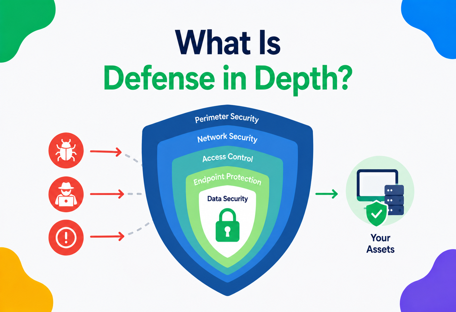
Defence in Depth
What: Layering multiple, independent security controls so no single failure compromises the whole system. Why: It lets each individual layer be less aggressive (and therefore more usable) because it is not carrying the entire security burden alone. Analogy: A castle with a moat, a wall, and a guarded gate — breaching one layer does not mean breaching the castle. Example: Network firewall + application authentication + database-level row permissions + audit logging, stacked together.
Principle of Least Privilege
What: Every user, process, or service should have exactly the access it needs — no more. Why: It shrinks the “blast radius” if any single credential is compromised. Example: A reporting dashboard’s database user can only run SELECT queries; it never has DELETE permission, even though a human admin does.
Secure Defaults
What: Designing the out-of-the-box configuration to be safe, so users do not have to actively “turn on” security. Why: Most users never change default settings — if the default is insecure, most installations will be insecure. Example: A new S3 bucket defaulting to private (not public) unless someone deliberately makes it public.
Progressive Trust / Step-Up Auth
What: Starting a session with a low-friction check and asking for additional proof only when the user attempts a higher-value action. Why: It avoids front-loading all the friction at login when most of a session involves low-risk browsing. Example: You can browse your bank app with just a fingerprint, but transferring money over ₹1,00,000 asks for an OTP as well.
UX-Security Debt
What: The accumulated cost of security shortcuts that harm usability (or usability shortcuts that harm security), paid later in support tickets, churn, or breaches. Why: Like technical debt, it is invisible at first and expensive later. Example: Forcing password rotation every 30 days looks rigorous on a compliance checklist, but NIST itself now advises against it because it drives predictable, weaker passwords (e.g., Summer2024! → Summer2025!).
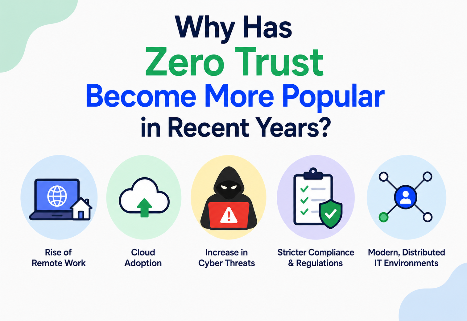
Zero-Trust Architecture
What: An approach that assumes no request should be trusted by default, even if it originates inside the corporate network — every request is verified on its own merits. Why: Traditional “castle and moat” security assumed anything inside the network perimeter was safe, but that assumption collapses the moment an attacker gets past the perimeter once. Example: An engineer connecting to an internal admin panel is re-verified by device posture and identity on every request, not just once at VPN login.
Shadow IT / Workaround Culture
What: The tools, spreadsheets, and personal accounts employees quietly adopt when the official, secure system is too slow or restrictive to get their job done. Why it matters: It is the clearest possible evidence that a security control has crossed the “compliance budget” line — people are not being malicious, they are routing around friction to stay productive. Example: A sales team exporting customer data to a personal Google Sheet because the CRM’s approval workflow for a simple discount takes three days.
Usable-Security Metrics — the Compliance Budget in Numbers
Security researchers (notably at Microsoft Research) have shown that each employee has a roughly fixed daily tolerance for security-related effort — a “compliance budget” spent across every login, every approval click, every password reset. Once a system overdraws that budget, users do not become more compliant; they become creative at avoiding the friction altogether, often in ways far less secure than the original control intended.
The Anatomy of a Balanced System
Balancing security and usability is not a single decision — it is a system made of several cooperating components. Here is what a typical enterprise-grade balanced security architecture looks like.
Let us walk through each component and the usability decision baked into it:
- WAF & Rate Limiter (Edge): Silent to legitimate users. This is the “free” security layer — it protects against bots and abuse without ever showing the human user a prompt.
- Identity Provider (IDP) / SSO: Centralises login so a user authenticates once and gets access to many internal apps — a huge usability win that also improves security, because it removes dozens of separate weak passwords.
- Risk Scoring Engine: Looks at signals — device fingerprint, IP reputation, geo-velocity (impossible travel), time of day — and produces a risk score in milliseconds.
- Adaptive MFA: Only triggered when the risk score crosses a threshold. Most logins never see it.
- API Gateway: The single choke point where authentication tokens are validated, keeping individual services simple.
- RBAC / ABAC layer: Enforces “least privilege” without requiring engineers to hard-code permission checks everywhere.
- Audit Log Store: Invisible to the user, but critical for after-the-fact investigation — the “seatbelt” that does not get in the way until you need it.
- KMS (Key Management Service): Encrypts data at rest so that even a database leak does not expose raw data — with zero impact on how users experience the product.
Notice how many of these components add security without adding user-visible friction: WAF, rate limiting, RBAC, audit logging, and encryption at rest are all invisible to the end user. The visible friction — MFA, step-up prompts — is deliberately pushed to the smallest possible surface area (the Risk Scoring Engine), and only activated when justified. This is the architectural pattern behind “secure by default, usable by design.”
How the Balance Is Actually Computed
Let us zoom into the piece that does the real balancing act: the risk-based authentication engine. This is where the abstract idea of “let us be usable AND secure” becomes concrete code.
Signal Collection
On every login attempt, the system gathers lightweight signals without asking the user anything extra:
// Java - Spring Boot service collecting login-risk signals
public class LoginRiskSignals {
    private final String deviceFingerprint;
    private final String ipAddress;
    private final String userAgent;
    private final Instant attemptTime;
    private final GeoLocation geoLocation;
    private final boolean knownDevice;

    // Constructed by an interceptor before authentication runs
    public LoginRiskSignals(HttpServletRequest request, String userId, DeviceRepository deviceRepo) {
        this.deviceFingerprint = DeviceFingerprintUtil.compute(request);
        this.ipAddress        = request.getRemoteAddr();
        this.userAgent        = request.getHeader("User-Agent");
        this.attemptTime      = Instant.now();
        this.geoLocation      = GeoIpService.lookup(ipAddress);
        this.knownDevice      = deviceRepo.existsByUserIdAndFingerprint(userId, deviceFingerprint);
    }
}
Scoring
@Service
public class RiskScoringService {

    public RiskLevel score(LoginRiskSignals signals, UserLoginHistory history) {
        int riskPoints = 0;

        if (!signals.isKnownDevice())                                riskPoints += 30;
        if (isImpossibleTravel(signals, history))                    riskPoints += 40;
        if (IpReputationService.isSuspicious(signals.getIpAddress())) riskPoints += 25;
        if (isOutsideUsualHours(signals, history))                   riskPoints += 10;

        if (riskPoints >= 60) return RiskLevel.HIGH;
        if (riskPoints >= 25) return RiskLevel.MEDIUM;
        return RiskLevel.LOW;
    }

    private boolean isImpossibleTravel(LoginRiskSignals current, UserLoginHistory history) {
        GeoLocation last = history.getLastKnownLocation();
        if (last == null) return false;
        double distanceKm    = GeoUtil.distanceKm(last, current.getGeoLocation());
        double hoursSinceLast = Duration.between(history.getLastLoginTime(),
                current.getAttemptTime()).toMinutes() / 60.0;
        double impliedSpeed = distanceKm / Math.max(hoursSinceLast, 0.01);
        return impliedSpeed > 900; // faster than a commercial flight
    }
}
Deciding the Friction Level
@Service
public class AdaptiveAuthDecisionService {

    public AuthChallenge decide(RiskLevel level) {
        return switch (level) {
            case LOW    -> AuthChallenge.NONE;               // password only, no extra step
            case MEDIUM -> AuthChallenge.PUSH_NOTIFICATION;  // one-tap approval
            case HIGH   -> AuthChallenge.OTP_PLUS_EMAIL_ALERT; // full step-up + notify user
        };
    }
}
This is the essence of balancing: the same authentication system produces three very different user experiences depending on real-time risk, rather than forcing every user through the strictest path every time.
Beginner: A simple to-do list app might just check “is the password correct?” — one binary gate, appropriate because the stakes are low.
Production (banking-grade): A payments platform like the one used by Stripe or Razorpay recomputes risk on every sensitive action (not just login) — moving money, adding a payee, or changing a password all re-trigger the risk engine independently.
A Balanced Login, Step by Step
Here is the end-to-end lifecycle of a single login attempt as it flows through a risk-adaptive system, from the user’s tap to the final decision.
User Enters Credentials
The user types their username and password (or presents a biometric) in the client app.
Client → API Gateway (POST /login)
The credentials travel over TLS to the gateway, which forwards them to the authentication service.
Auth Service Validates Credentials
The password is checked against a securely hashed value, or the biometric assertion is verified against the registered public key.
Auth → Risk Engine (Signals Attached)
Device fingerprint, IP, geo-velocity, and time-of-day signals are sent to the risk engine, which returns a level like MEDIUM.
Adaptive MFA Triggered
Because the level is MEDIUM, a push notification is sent to the user’s registered device.
User Taps “Approve”
The MFA service confirms the approval and forwards the result to the auth service.
Audit Log Entry Written
An immutable record is written: user, device, geo, risk level, decision, correlation ID.
Short-Lived Access Token Issued
A JWT valid for minutes is returned to the client along with a longer-lived refresh token.
Client Shows “Logged In”
The user experiences a single, mostly-frictionless flow (type, tap) while five distinct decisions ran behind the scenes.
Notice the two things happening simultaneously: the user experiences a single, mostly-frictionless flow (type password, tap approve), while behind the scenes the system runs five distinct decisions and writes an immutable audit trail. That is the architecture doing the heavy lifting so the human does not have to.
Token Lifecycle
Once authenticated, most modern systems issue a short-lived access token (minutes to an hour) plus a longer-lived refresh token. This is itself a usability/security compromise: short access tokens limit the damage if one leaks, while the refresh token means the user is not forced to log in again every ten minutes.
| Token Type | Typical Lifetime | Why |
|---|---|---|
| Access token | 5–60 minutes | Short blast radius if stolen |
| Refresh token | Days to weeks | Avoids repeated logins; revocable server-side |
| “Remember this device” token | 30–90 days | Skips MFA on trusted devices to reduce friction |
Pros, Cons & the Cost of Each Lean
Every architectural lean — toward more security or toward more usability — has a well-understood set of gains and costs. Naming them out loud is what makes the decision deliberate.
Leaning Secure — Pros
Lower breach risk, easier regulatory compliance, stronger customer trust in regulated industries (banking, healthcare), reduced fraud losses.
Leaning Secure — Cons
Higher drop-off and churn, more support tickets (“I’m locked out”), slower feature velocity, user frustration, risk of insecure workarounds.
Leaning Usable — Pros
Higher conversion and retention, faster onboarding, happier users, lower support cost.
Leaning Usable — Cons
Larger attack surface, higher breach probability, potential regulatory non-compliance, reputational risk if a breach occurs.
The trade-off is rarely linear. Early usability improvements (removing an unnecessary field, using biometrics instead of typed passwords) often cost nothing in security — sometimes they even improve it, since biometrics are harder to phish than a password. But past a certain point, every additional bit of convenience does cost real security, and the architect’s job is to know where that inflection point is for a given system and its threat model.
A Slow Security Layer Is Also a UX Bug
Security controls that are too slow become a usability problem in disguise — a risk engine that takes three seconds to respond will feel exactly like a broken app to the user, regardless of how well-designed its logic is. Architects have to treat the security path as a first-class performance path.
- Risk scoring must be near-instant. Production systems typically budget under 100 ms for a risk decision, using cached device and IP reputation data rather than live lookups on every request.
- Token validation should be stateless where possible. JWTs validated by signature (rather than a database round-trip per request) let API gateways scale horizontally without the auth check becoming a bottleneck.
- Encryption has a real CPU cost. At high scale (think Netflix serving millions of concurrent streams), TLS termination is offloaded to dedicated hardware or edge proxies so it does not compete with application logic for CPU.
- Caching permission checks. A user’s roles rarely change second-to-second; caching RBAC lookups for a short TTL (say, 60 seconds) avoids hammering the authorisation service on every click, keeping the app snappy without meaningfully increasing risk.
Teams sometimes “fix” a slow security check by removing it under load, rather than making it fast. This quietly reintroduces the exact risk the control was meant to prevent, and it usually happens invisibly during a traffic spike — the worst possible time.
If Login Is Down, Nothing Else Matters
If your authentication system goes down, your entire product goes down with it — no login means no usage at all. This makes the identity layer one of the most reliability-critical parts of any architecture, and reliability itself is part of “usability”: a system that is secure but frequently unavailable is not, in any meaningful sense, usable.
Replication for Identity Data
User credentials, sessions, and permission data are typically replicated across multiple nodes or regions so that no single database failure locks every user out simultaneously. This connects directly to the CAP theorem: during a network partition, an identity system usually favours availability for read operations like “is this token valid?” (so users can keep working) while favouring consistency for write operations like “revoke this user’s access immediately” (so a fired employee cannot slip through a stale replica).
Graceful Degradation
Mature systems design fallback behaviour: if the adaptive risk engine is unreachable, does the system fail open (allow login with just a password) or fail closed (block all logins)? Most production systems fail toward a slightly higher-friction but functioning path — e.g., default to always requiring MFA if the risk engine cannot be reached — rather than either extreme.
Disaster Recovery
Backup identity providers, offline-capable local caches of permissions, and “break-glass” emergency admin accounts (heavily audited, rarely used) are all part of ensuring the security layer does not become the single point of failure for the whole business.
Consensus and Coordination During Failover
When an identity cluster fails over from a primary region to a secondary one, the nodes involved need to agree on which node is now authoritative before either serving traffic or, especially, before allowing sensitive writes like a permission revocation. Consensus protocols such as Raft or Paxos (used internally by systems like etcd, which backs many identity and configuration stores) ensure that a majority of nodes agree on the current state before it is considered committed. This matters for the security-usability balance in a subtle but important way: without consensus, a network partition could let two nodes each believe they are “primary,” potentially allowing a revoked session to remain valid on one side of a split — a security hole introduced purely by an availability mechanism that was not coordinated correctly.
Designing for Partial Failure
Large-scale systems rarely fail completely; more often, one dependency (say, the SMS gateway used for OTPs) becomes slow or unavailable while everything else works fine. Well-balanced architectures build explicit fallback chains — if SMS OTP delivery fails, fall back to email OTP; if that also fails, fall back to a previously-registered authenticator app — rather than presenting the user with a hard failure. This keeps the system usable during a partial outage without ever silently disabling the underlying security requirement; it simply offers an alternative, equally strong path to satisfy it.
Controls That Buy Real Security Without Real Friction
This section goes one level deeper into the actual security techniques architects use to keep systems safe while preserving usability.
Passwordless & Biometric Authentication
Passkeys (based on the WebAuthn / FIDO2 standard) let users authenticate with a fingerprint, face scan, or device PIN instead of typing a password. This is a rare case where security and usability move in the same direction: passkeys are both easier to use (no typing, no forgetting) and dramatically harder to phish than passwords, because the private key never leaves the user’s device.
Single Sign-On (SSO) and Federated Identity
Instead of forcing users to manage ten separate passwords for ten internal tools, SSO centralises authentication through one trusted identity provider (e.g., Okta, Azure AD, Google Workspace). One strong login replaces ten weak ones — again, both more usable and more secure.
Role-Based and Attribute-Based Access Control (RBAC / ABAC)
@RestController
@RequestMapping("/api/invoices")
public class InvoiceController {

    @PreAuthorize("hasRole('FINANCE_ADMIN')")
    @DeleteMapping("/{id}")
    public ResponseEntity<Void> deleteInvoice(@PathVariable Long id) {
        invoiceService.delete(id);
        return ResponseEntity.noContent().build();
    }

    @PreAuthorize("hasAnyRole('FINANCE_ADMIN','FINANCE_VIEWER')")
    @GetMapping("/{id}")
    public ResponseEntity<Invoice> getInvoice(@PathVariable Long id) {
        return ResponseEntity.ok(invoiceService.findById(id));
    }
}
RBAC keeps the permission model simple enough that non-security engineers can reason about it, which is itself a usability property — for the developers maintaining the system, not just end users.
Encryption Without User-Visible Friction
TLS in transit and AES-256 at rest are essentially invisible to end users, delivered entirely by infrastructure (load balancers, KMS-integrated databases). This is the cleanest form of “free” security — no UX cost at all.
Rate Limiting & Account Lockout — Carefully Tuned
Locking an account after 3 failed attempts stops brute-force attacks but also locks out a legitimate user who fat-fingered their password twice. Balanced systems use progressive delays instead of hard lockouts — each failed attempt adds a short, increasing delay (1 s, 2 s, 5 s, 15 s…) rather than a full lockout, slowing attackers to a crawl without permanently blocking a real user.
Consent and Transparency
Under laws like India’s DPDP Act 2023 or the EU’s GDPR, users must be told what data is collected and why. Good architecture makes this a one-time, clear consent screen rather than a wall of legal text repeated on every visit — satisfying the legal and security requirement while respecting the user’s time.
Account-lockout counters and session-revocation lists are shared, frequently-updated state accessed by many concurrent requests. Architects typically use atomic counters in a fast store like Redis (INCR with a TTL) rather than a relational-database row lock, avoiding contention that would otherwise slow down login for every user during a spike in failed attempts.
You Cannot Balance What You Cannot Measure
Balanced architectures track both sides of the equation continuously — because a security win that quietly destroys usability, or a usability win that quietly destroys security, is not really a win at all.
| Security Metrics | Usability Metrics |
|---|---|
| Failed login rate | Login success rate / time-to-login |
| MFA challenge trigger rate | MFA abandonment rate |
| Account takeover incidents | Support tickets for “locked out” |
| Anomalous access alerts | Session duration / drop-off funnel |
| Time-to-detect a breach | Net Promoter Score after security changes |
A well-run architecture team reviews these two columns together, not in separate meetings. If MFA abandonment spikes right after a policy change, that is a signal the security team pushed too far past the compliance budget — and it should trigger a redesign, not just a security congratulations.
Structured logging (correlation IDs tying a single user action across services) and centralised observability (e.g., via the ELK stack, Datadog, or Grafana) let architects see exactly where in a flow users abandon a secure action, which is the raw material for tuning the balance over time.
Building a Joint Dashboard
A practical technique many architecture teams use is a single shared dashboard, reviewed weekly, that plots security and usability metrics on the same timeline. When a new security policy ships, its effect on both columns is visible immediately, side by side, instead of security metrics living in a SIEM tool that product managers never open, and usability metrics living in an analytics tool that security engineers never open. Correlating deploy timestamps with both sets of metrics makes it obvious, quickly, whether a given change was a net improvement or simply moved the pain from one team’s dashboard to another’s.
Alerting Thresholds That Respect Both Sides
Just as security teams set alert thresholds for anomalous login patterns, usability-aware architectures set alert thresholds for friction: if MFA abandonment crosses, say, 8 % in a rolling 24-hour window, that should page someone just as reliably as a spike in failed logins would. Treating usability regressions as first-class incidents — not just “product feedback to consider next quarter” — is often the single biggest cultural shift that makes a security-usability balance sustainable in practice, rather than something that quietly erodes release after release.
The Balance Ships as Configuration
Cloud platforms (AWS, Azure, GCP) ship many security and usability decisions as configuration rather than code, and the defaults matter enormously.
- Managed identity services (AWS Cognito, Azure AD B2C, Auth0) come with secure defaults out of the box — sensible password policies, built-in adaptive MFA — so teams do not have to reinvent risk engines from scratch.
- Infrastructure as Code (IaC) lets architects encode the “balance point” once (e.g., a Terraform module defining standard IAM roles) and reuse it consistently across every environment, rather than every team reinventing it slightly differently.
- Secrets management (AWS Secrets Manager, HashiCorp Vault) removes the temptation for developers to hard-code credentials for convenience — a classic case where a small usability shortcut (skip the vault, just paste the key) creates a large security hole.
- Blue-green and canary deployments allow security-policy changes (like a stricter MFA rule) to be rolled out to 5 % of users first, so architects can observe the usability impact on metrics before committing the whole user base.
Multi-Region Deployment and Data Residency
Global products often need to balance a third dimension alongside security and usability: regulatory data residency. A user in the EU may need their data encrypted and stored within EU borders; a user in India may fall under DPDP Act requirements about where personal data can be processed. Cloud-native architectures handle this by deploying regional identity and data clusters, routing users automatically to their compliant region — a decision that happens entirely behind the scenes, so the user experiences a single, fast, consistent login regardless of which physical region actually serves their request.
Feature Flags as a Safety Valve
Feature flag systems (LaunchDarkly, Unleash, or a home-grown equivalent) give architects a fast, reversible lever for tuning the security-usability balance after launch. Instead of shipping a stricter password policy as a hard-coded, all-or-nothing release, wrapping it in a feature flag lets the team dial the policy up gradually, watch the metrics dashboard described earlier, and instantly roll back if usability metrics degrade faster than expected — turning what used to be a risky, one-way deployment into a reversible, low-stakes experiment.
The Data Layer Has Its Own Balance
The data layer has its own balance to strike — between strong protection at rest, fast reads, and revocations that actually take effect quickly.
Databases
Row-level security (e.g., PostgreSQL Row Level Security policies) lets the database itself enforce “a user can only see their own records,” so application code cannot accidentally leak data through a missed check — strong security with zero added steps for the end user.
Caching
Caching session and permission data (in Redis or Memcached) is what makes low-latency, frictionless authorisation possible at scale. But cached permissions can go stale — if you revoke someone’s access, a short cache TTL (rather than “cache forever”) ensures the revocation takes effect within seconds rather than hours, balancing performance against the security need for timely revocation.
Load Balancing
Sticky sessions (routing a user to the same backend node) can simplify session handling, but they also complicate horizontal scaling and failover. Most modern architectures avoid stickiness entirely by keeping sessions stateless (signed tokens) so any node can serve any request — better for both reliability and, indirectly, for keeping the login experience consistent everywhere.
The Balance Reappears at Every API Boundary
In a microservices world, the security-usability balance has to be re-solved at the API layer, for both human users and machine-to-machine calls.
API Gateway as the Single Trust Boundary
Rather than making every microservice independently re-implement authentication, a single API Gateway validates tokens once and passes a lightweight, verified identity context downstream (e.g., via a signed header). This keeps each individual service simple, and keeps the “log in once” experience intact for the caller even though dozens of services may be involved behind the scenes.
@Component
public class JwtAuthGatewayFilter implements GlobalFilter {

    @Override
    public Mono<Void> filter(ServerWebExchange exchange, GatewayFilterChain chain) {
        String token = extractBearerToken(exchange.getRequest());
        if (token == null || !jwtValidator.isValid(token)) {
            exchange.getResponse().setStatusCode(HttpStatus.UNAUTHORIZED);
            return exchange.getResponse().setComplete();
        }
        UserContext ctx = jwtValidator.extractContext(token);
        ServerHttpRequest mutated = exchange.getRequest().mutate()
                .header("X-User-Id", ctx.getUserId())
                .header("X-User-Roles", String.join(",", ctx.getRoles()))
                .build();
        return chain.filter(exchange.mutate().request(mutated).build());
    }
}
OAuth 2.0 and Scoped Access
OAuth lets a user grant a third-party app limited access (“read my calendar” but not “delete my account”) without ever sharing their actual password with that app. This is a textbook example of good balance: strong security (no shared credentials, revocable, time-limited) delivered through a familiar, low-friction “Allow” button.
Idempotency and Safe Retries
Secure APIs that reject retried requests outright (to prevent replay attacks) can accidentally punish users on flaky mobile networks. Using idempotency keys lets a client safely retry a payment request without either double-charging the user or forcing them to start over — security and usability solved by the same mechanism.
The Shortlist Worth Memorising
A handful of patterns show up again and again in balanced architectures — and a handful of anti-patterns show up again and again in the breach post-mortems that follow.
Helpful Patterns
Progressive Disclosure of Security Controls
Show advanced security settings only to users who go looking for them (e.g., a “Security” tab), keeping the default experience clean.
Sane, Secure Defaults
Ship the safest reasonable configuration out of the box, so users who never touch settings are still protected.
Fail-Safe UX for Security Errors
Instead of a raw “403 Forbidden,” show “You don’t have access to this — request it here,” turning a dead end into a usable path.
Just-in-Time Permission Requests
Ask for camera access at the moment the user tries to scan a QR code, not on app launch, so the request has clear context and is more likely to be understood and accepted.
Anti-Patterns to Avoid
Hiding a feature instead of properly authorising it; it looks secure but collapses the moment someone finds the URL.
So many “Are you sure?” dialogs that users click through them without reading, defeating the entire purpose.
Created because per-user provisioning was too tedious; destroys both accountability and least privilege at once.
Controls that exist purely to look rigorous (e.g., pointless CAPTCHAs on low-risk pages) without meaningfully stopping any real threat, while still costing real usability.
Forcing the same heavy step-up flow on every user for every action, regardless of actual risk, guarantees the highest possible friction for the lowest possible security gain.
How Mature Teams Actually Work
The habits below are what separate teams that stay balanced over time from teams that oscillate between “too strict” and “too loose” every couple of quarters.
Do
- Measure usability and security metrics side by side.
- Use risk-based, adaptive controls.
- Default to secure, but let users see and understand why.
- Test security flows with real users, not just red teams.
Don’t
- Ship security decisions without a UX review.
- Assume more friction always equals more security.
- Treat compliance checklists as a substitute for real threat modelling.
- Bury important security prompts in dense legal language.
A recurring, high-impact mistake is treating security and product / UX as separate work-streams that meet only at a review gate near launch. By then, expensive rework is the only option. The architectures that balance this best involve security engineers and UX designers in the same design reviews from day one — threat modelling and user-journey mapping happening in the same room.
Running a Joint Threat-Model + Journey-Map Session
A concrete practice that works well: before building a new sensitive flow (say, “change bank account details”), bring the security engineer and the UX designer into the same room with two artifacts on the table — a threat model (what could go wrong, and how bad is it) and a user-journey map (every screen, click, and wait the user experiences). Walking through both together, step by step, surfaces the trade-off explicitly at each point, rather than each discipline optimising its own artifact in isolation and clashing only when the designs collide in code review.
Writing the Friction Budget Down
Teams that treat this well often go one step further and write an explicit “friction budget” document for a product area — a short statement like: “For a first-time sign-up, we accept at most one identity field plus a single OTP; anything more requires a product review.” Making the budget explicit, in writing, prevents it from being silently spent feature-by-feature by different teams who never talk to each other, each individually convinced their one extra field or one extra confirmation is harmless in isolation. Over time, this written budget becomes a shared, durable reference point that new engineers and designers can consult without having to relearn the same hard-won lessons from scratch.
Revisiting Decisions as the Threat Landscape Changes
The right balance point is not fixed forever. A control that was reasonable five years ago (SMS-based OTP, for instance) may become comparatively weak as SIM-swap fraud grows more common, while a control that once felt burdensome (biometric passkeys) may become both stronger and easier as device support matures. Architects should schedule periodic reviews — not just react to an incident — to re-examine whether yesterday’s balance point still holds today.
How the Industry Actually Does It
A short tour of how well-known organisations translate the balance into daily product decisions — and one case study from national infrastructure.
Profiles Without Passwords
Netflix profiles within a single account use no password at all — just a tap on an avatar — because the “risk” of a family member accessing a kids’ cartoon profile is trivially low. But changing the account’s payment method or password requires re-authentication. Netflix concentrates friction exactly where the stakes are highest.
Browse Free, Pay Verified
Amazon lets you browse and add to cart without logging in at all, but requires re-entering your password (or a step-up check) at the actual moment of purchase — separating low-risk browsing from high-risk spending, rather than gating the entire site behind a login wall.
Adaptive Login
Google’s account system pioneered widespread adaptive / risk-based login — a login from a new country instantly triggers extra verification, while a login from your usual laptop, on your usual Wi-Fi, at your usual time, sails through with just a password (or now, a passkey).
Different Sides, Different Friction
Uber uses passwordless, OTP-based login for riders (optimising for the fastest possible first booking) while requiring background checks, document verification, and periodic re-verification for drivers — because the trust-and-safety stakes are completely different for each side of the marketplace, so the architecture treats them differently.
Adjustable Friction as a Feature
Large enterprise software vendors (Salesforce, Workday, ServiceNow, and similar TC/CRM/ERP platforms — the same category many architects, including those working on internal TC platforms, build for) increasingly default new customers into SSO plus adaptive MFA, while allowing individual customers to configure stricter policies (IP allow-listing, mandatory hardware security keys) for their most sensitive user groups, such as finance or HR admins.
Front-Loaded Verification, Fast Daily Use
India’s Unified Payments Interface (UPI) requires a real one-time bank-grade verification (linking a debit card and setting a UPI PIN), but once set up, every subsequent payment needs only a 4–6 digit PIN — no password, no OTP, no repeated document checks. Transaction limits, device-binding and mandatory PIN re-entry above certain amounts add layered protection without slowing down millions of everyday transactions.
Enterprise SaaS Platforms — The Tiered-Friction Lesson
Large enterprise software vendors increasingly default new customers into SSO plus adaptive MFA, while allowing individual customers to configure stricter policies (IP allow-listing, mandatory hardware security keys) for their most sensitive user groups, such as finance or HR admins. This tiered approach lets a 50-person start-up and a 50,000-employee bank use the same underlying platform with dramatically different friction levels — configured, not hard-coded — which is itself an architectural lesson: build the capability for adjustable friction into the platform once, and let each customer’s risk appetite decide where the dial sits.
Frequently Asked Questions
The questions engineers, product leads, and interviewers ask most often once the topic of “security vs usability” is on the table.
A Simple Framework Architects Can Reuse
When facing a concrete design decision — “should this action require re-authentication?” — a practical framework is to ask four questions in order:
- What is the worst realistic outcome if this action is performed by an attacker instead of the legitimate user? (Financial loss? Data exposure? Reputational damage? Or genuinely nothing much?)
- How reversible is that outcome? A wrong “like” on a post is trivially reversible; an executed wire transfer is not.
- How much friction can this specific user journey tolerate before drop-off becomes unacceptable? A first-time sign-up flow has almost zero tolerance; a rarely-used “delete my entire account” flow can tolerate a lot.
- Is there a mechanism (adaptive risk scoring, device trust, behavioural signals) that lets us apply friction only when risk is actually elevated, rather than for every user every time?
Answering these four questions honestly, for every sensitive action in a system, is usually enough to arrive at a defensible, well-balanced design — without needing a company-wide security-versus-UX debate for every single feature.
Summary
Balancing security with usability is not a slogan; it is a set of engineering practices that, applied consistently, let a system be both hard to break and easy to use. The core moves are the same across almost every well-run product: measure both sides continuously, spend friction like a scarce resource, layer independent controls so no single one has to be extreme, apply the strictest checks only when the risk score justifies them, and treat every visible security prompt as a UX decision that costs part of the shared compliance budget. The most damaging failures in industry — from Equifax to countless smaller SaaS breaches — almost always trace back not to a missing control, but to a control that existed on paper and was silently bypassed because it was too painful to use.
Key Takeaways
- Security and usability are not fixed opposites — they only trade off past a certain point; below that point, good design improves both together.
- Risk-based / adaptive controls, defence in depth, secure defaults, and progressive trust are the core architectural tools for finding the balance.
- Most of the strongest security in a well-designed system is invisible to the user — encryption, WAFs, RBAC, and audit logging cost nothing in UX.
- The friction that is user-visible (MFA, step-up prompts, confirmations) should be concentrated exactly where risk is highest, not spread evenly.
- Measure both sides continuously — security incidents and usability metrics — and treat a spike in either as a signal to redesign, not just to tighten or loosen a single knob.
- The best architectures are reviewed jointly by security and UX from the start, not reconciled at the end.