Why Do Interviewers Ask You to Draw Diagrams During System Design Rounds?
A complete, beginner‑friendly guide to the real reason behind the whiteboard — what interviewers are silently checking as you sketch, and how to turn a simple box‑and‑arrow habit into your biggest interview advantage.
Introduction & History
Software systems are just treehouses with more zeros. Before anyone picks up a hammer — or types a single line of code — someone sketches the plan. Interview whiteboards exist for exactly that reason.
Picture yourself trying to build a treehouse with a friend. Before either of you picks up a hammer, you almost certainly reach for a piece of paper and sketch it out first — where the ladder attaches, how wide the platform sits, where the roof slants over the top. You do this because starting with wood and figuring things out mid‑swing is a reliable way to end up with a wobbly, dangerous treehouse.
Software systems are the very same idea, only vastly bigger. A “system design interview round” is a slice of a technical job interview where a company asks you to design a large piece of software — something on the scale of Instagram, Uber, or a URL shortener — on a whiteboard or a shared document, usually inside a 45 to 60 minute window. And almost without exception, the interviewer expects you to draw a diagram while you talk.
A system design interview is a bit like being asked, “Design a school building for 2,000 students,” and instead of merely describing it in sentences, you are expected to sketch the floor plan — where the classrooms sit, where the exits open, how students flow between periods. The sketch is what turns a vague idea into a plan that can actually be checked.
A short history of the whiteboard interview
The whiteboard tradition grew out of the large tech companies of the 1990s and 2000s — Microsoft, Google, and later Amazon and Facebook — who needed a quick way to see how an engineer thinks, not just what they had memorised. The earliest versions of the interview leaned heavily on algorithms drawn out on a wall: sorting a list, reversing a tree, that sort of thing. Over the years, as companies began operating enormous distributed systems (software spread across thousands of computers), a new kind of interview took shape: the system design interview. Instead of “write the code for X,” interviewers started asking “how would you build X at scale?” And because that sort of system cannot possibly be described in a single sentence, drawing quickly became the natural way to explain it.
Today, the round is a standard fixture in almost every mid‑to‑senior software engineering interview loop, at companies of every size — from five‑person start‑ups all the way up to Google. It usually appears after the coding rounds, and it is very often the round that separates a “good coder” from someone ready to grow into a “system architect.”

Why this topic matters
A lot of candidates pour all their energy into writing correct code and quietly forget that in system design rounds, the diagram is the primary language of communication. This guide is a beginner‑friendly, complete walk‑through of exactly why interviewers ask for diagrams, what they are secretly evaluating while you draw one, and how you can use diagrams to your advantage — even if you have never drawn one before in your life.
Problem & Motivation
The interviewer has 45 minutes to decide whether you can help design software millions of people will use. Words alone make that decision almost impossible. A diagram is what changes the odds.
Start with the problem the interviewer is actually trying to solve. Imagine that they have 45 minutes with you. Inside that window, they need to answer one enormous question: “Can this person be trusted to help design software that millions of people will use?” That is a big call to make quickly, and spoken language alone makes it painfully hard.
The problem with words‑only explanations
If you only talk about a system — “so there is a load balancer, and it feeds into a service, and the service talks to a database, and there is also a cache somewhere” — the interviewer is forced to build a mental picture entirely inside their own head, using only your spoken words, in real time, while simultaneously listening for mistakes. That is hard for two very concrete reasons:
- Human memory has a ceiling. Psychologists have shown that people can only hold about three to five new, unrelated pieces of information in short‑term memory at once. A realistic system may have ten to fifteen moving parts (users, load balancer, API gateway, half a dozen microservices, a cache, a primary database, replicas, a message queue, a CDN). Pure speech overloads that memory almost instantly.
- Words leave gaps. If you say “the service talks to the database,” is that one service or three? Does “the cache” sit in front of the database, or inside each service? Spoken sentences leave ambiguity that a picture closes in a single stroke.
A diagram is a shared, persistent, and precise piece of external memory that both you and the interviewer can point to, question, and correct — something no amount of spoken narration can quite match.
What interviewers are really testing
Contrary to what many beginners assume, the interviewer is not primarily judging whether you can produce tidy boxes and elegant arrows. They are watching for several much deeper skills, and the diagram simply happens to be the tool that surfaces them:
- Structured thinking — can you break an enormous, vague problem (“design Instagram”) into smaller, named, connected pieces?
- Communication — can you explain complex technical ideas in a way another human, who cannot read minds, can genuinely follow?
- Prioritization — do you sketch the important pieces first, or do you sink into small details right away?
- Trade‑off awareness — do you signal that you understand no design is ever “correct,” only better or worse suited to a given goal?
- Real‑world engineering maturity — are failure, scale, and cost part of your picture, or are you only drawing the happy path?
Put simply: the diagram is the interviewer’s window into how your brain organises complexity. That is the actual problem being solved — and everything else in this tutorial builds on that single idea.
Core Concepts
Before going deeper, five short definitions. Each one follows the same friendly pattern — what it is, why it exists, where it is used, an everyday analogy, and a plain example.
Before we go any further, let’s pin down the basic vocabulary you will lean on for the rest of the guide. Every term below follows the same short pattern: what it is, why it exists, where it is used, an analogy, and an example.
- What
- The process of deciding how the different parts of a software application will be structured, connected, and scaled to meet a set of goals — speed, reliability, cost.
- Why
- Software serving millions of people cannot be built by accident. Just like a bridge needs a blueprint before construction, a big system needs a plan before code.
- Where
- Every time a large system gets built: social networks, ride‑sharing apps, payment platforms, streaming services.
- Analogy
- Laying out a city’s road network long before any car ever drives on it.
- Example
- Deciding that a photo‑sharing app needs a separate service for uploads and a different one for producing the news feed.
- What
- A visual drawing made of boxes (components) and arrows (connections and data flow) that shows how a system’s parts fit together.
- Why
- It compresses a complex system into a picture the brain can absorb in seconds, instead of paragraphs that take minutes to work through.
- Where
- Interviews, engineering design documents, onboarding decks for new hires, and incident post‑mortems.
- Analogy
- A subway map — you do not need to see every rail bolt, only which lines connect which stations.
- Example
- A box labelled “Mobile App,” an arrow to a box labelled “API Server,” and another arrow to a box called “Database.”
- What
- One independent piece of the system that does one job well — a database, a cache, a queue, a service.
- Why
- Breaking a system into components lets each piece be built, scaled, tested and repaired on its own without disturbing the rest.
- Where
- Every non‑trivial software system.
- Analogy
- Organs in a body — the heart pumps blood, the lungs handle oxygen; each has one clear, separate responsibility.
- Example
- A “Payment Service” component whose only job is to charge credit cards.
- What
- The path information takes as it moves through the system, from where it enters to where it is finally stored or returned.
- Why
- Following the data reveals bottlenecks, security exposures, and points where a single failure would hurt the most.
- Where
- Sequence diagrams, request/response flows, event pipelines.
- Analogy
- Water flowing through pipes in a house — from the main line, through the meter, and out through your kitchen tap.
- Example
- A user’s “like” on a post travels: App → API → Queue → Database → Notification Service.
Types of diagrams used in system design interviews
Not every kind of diagram belongs in every interview. The table below lays out the ones you will see most, and when to reach for each.
| Diagram Type | What It Shows | When to Use It |
|---|---|---|
| High‑Level Architecture | The major components and how they connect | First 10–15 minutes, to set the big picture |
| Sequence Diagram | The exact order of steps for one specific action (e.g. “user logs in”) | When explaining a tricky flow in detail |
| Data Model / ER Diagram | Database tables and their relationships | When discussing storage design |
| Deployment Diagram | How components are placed across servers, regions, or data centres | When discussing availability and scaling |
| State Diagram | The different “states” an object can be in (e.g. Order: Placed → Shipped → Delivered) | When a workflow has clear, distinct stages |
You do not have to use every one in every interview. Most interviews are ultimately won or lost on the high‑level architecture diagram alone, so that is the one this tutorial keeps returning to most heavily.
Architecture & Components: Anatomy of a Great Diagram
Real diagrams are built one box at a time, in the same order every experienced architect follows. Let’s design a simplified photo‑sharing system together, step by step.
Let’s now build a real diagram together, piece by piece, exactly the way you would in a live interview. We will use a simplified “photo‑sharing” system, similar in spirit to Instagram, as our running example.

Step 1 — Start with the client
Every system starts with someone using it. That someone lives inside what we call the client — a mobile app, a website, or another program that sends requests into the system.
Step 2 — Add the entry point
Requests never go straight to your servers. They usually pass through a load balancer (which spreads traffic across many servers so none is ever overwhelmed alone) and often an API gateway (a single front door that handles authentication, rate limiting, and routing to the right service).
Step 3 — Add services
Behind the gateway sit microservices — small, independent programs, each in charge of one feature. For our photo app that means an Upload Service, a Feed Service, and a Notification Service.
Step 4 — Add storage
Services need somewhere to keep their data: a database for structured information (usernames, captions, likes) and object storage (Amazon S3 is the canonical example) for large files like photos and videos.
Step 5 — Add a cache
A cache is a small, very fast storage layer that keeps frequently‑requested data close at hand, so the system does not have to ask the slow database every single time.
Step 6 — Add a queue
A message queue lets services communicate without waiting on one another, which is essential for slow tasks like resizing an uploaded photo into thumbnails.
Think of a busy restaurant. The client is the customer. The load balancer is the host who decides which waiter is free. The API gateway is the waiter who takes your order. The services are the different kitchen stations — grill, salad, dessert. The database is the pantry at the back. The cache is the small tray of ready‑made items kept at the counter so the kitchen does not have to cook the same popular dish from scratch every single time.
Internal Working: What Happens Inside the Interviewer’s Head
This section is the heart of the guide. While you are drawing on the whiteboard, the interviewer is quietly running a five‑part checklist — and every one of those parts is watching your diagram.
Let us slow down and look, in careful detail, at exactly what an interviewer is doing mentally while you draw.
1. They are building a mental checklist
Good interviewers use a rubric — a scoring checklist — even if they never show it to you. As you draw, they silently tick off items like: “did they ask about scale before designing?”, “did they name a database choice and justify it?”, “did they consider failure?” Your diagram is the evidence they use to check each box.
2. They are watching your reasoning order
A diagram is drawn over time, one box at a time, never all at once. The order in which you add pieces tells the interviewer how your mind moves. Someone who draws the database schema first — before even asking how many users the system needs to support — signals that they leap into implementation details before fully understanding the problem. Someone who first writes down the requirements, then sketches a simple box‑and‑arrow skeleton, then adds detail one layer at a time, signals mature engineering judgement.
3. They use the diagram to ask sharper questions
Once your components are on the board, the interviewer can point at one and ask, “what happens if this box crashes?” or “how does this box know which of the three replicas to talk to?” Without a diagram, they would first have to describe the box in words — burning precious interview minutes. A diagram lets them zoom in instantly.
4. They are checking for self‑correction
Nobody draws a perfect system on the first pass. Interviewers actively want to see you notice your own mistakes: “wait, if I put the cache here, stale data could be a problem — let me add a cache invalidation step.” That kind of live correction, visible because the diagram is sitting right there in front of both of you, is one of the strongest positive signals in the entire interview.
The diagram is not the goal. It is a side effect of good thinking that also happens to be extremely useful for the interviewer to observe, question, and score.
5. They are testing your ability to abstract
A component in a diagram is an abstraction — a simplified stand‑in for something much more complicated. A single box labelled “Database” may really represent dozens of servers, replication rules and backup systems. Being able to draw a box and say “I will treat this as one unit for now, and we can zoom in later,” shows the interviewer that you understand how real engineers manage complexity: hide detail until the moment it matters.
Data Flow & Lifecycle: Following One Request End‑to‑End
A high‑level architecture diagram shows the map. A sequence diagram shows the journey — and reveals whether you understand the difference between fast work and background work.
An architecture diagram shows the map. A sequence diagram shows the journey. Let’s trace, step by step, exactly what happens when a user uploads a photo in our example system.
Why this matters in an interview
Drawing this sequence proves you understand the difference between work that must finish before replying to the user (synchronous) and work that can happen quietly in the background (asynchronous). Knowing what to make asynchronous is one of the single most common “aha” moments interviewers listen for.
When you drop clothes off at the laundromat, you do not stand there and wait for the wash cycle to finish. You get a receipt (the 200 OK) and leave. The laundromat washes and dries the clothes in the background (the queue and the worker) and texts you when they are ready (the metadata update). If they insisted you stand in the shop the whole time, that would be a slow, synchronous design.
Lifecycle of data at rest
Beyond one single request, data also has a longer lifecycle over time: it is created (a photo is uploaded), read many times (shown in feeds), sometimes updated (a caption is edited), and eventually deleted (the user removes it) or archived (moved to cheaper, slower storage once it is old and rarely viewed). A strong candidate mentions this full lifecycle, not just the “create” step, because production systems must handle all of it — including compliance rules that require permanently deleting data when a user asks for it.
Advantages, Disadvantages & Trade‑offs
Every design decision trades one good thing for another. Interviewers deliberately probe this because real engineering is mostly about picking the least‑bad option for the situation, not chasing a mythical perfect answer.
Every design choice you make on the whiteboard buys one thing at the price of another. Interviewers deliberately probe this because production engineering is largely about picking the least bad trade‑off in a given situation, not producing some flawless answer that does not exist.
Advantages of diagramming during the interview
Less mental load
The diagram carries the map, so your working memory is free to reason, revise, and buy thinking time under pressure.
Shared reference
They can point, question, and score against a shared artefact, and later compare candidates against the same picture instead of vague memories.
Disadvantages and risks
Over‑drawing
Sinking time into making a diagram look “pretty” instead of reasoning about the problem quietly burns the interview budget.
Under‑explaining
Drawing in silence, however elegantly, leaves the interviewer guessing at your reasoning — defeating the whole purpose of the sketch.
The classic trade‑off diagram: the CAP theorem
The CAP theorem is one of the most famous ideas in distributed systems (systems made of many computers working together). It states that a distributed data system can only fully guarantee two of these three properties at the same time:
- Consistency (C) — every read returns the most recent write, everywhere.
- Availability (A) — every request gets a response, even when some servers are down.
- Partition Tolerance (P) — the system keeps working even if network connections between servers break.
Picture two friends writing notes on a shared whiteboard in different rooms, connected by a video call. If the video call drops (a network partition), they can either both stop writing until it reconnects (consistent but unavailable), or keep writing on their own whiteboards and reconcile the differences later (available but temporarily inconsistent).
Drawing this trade‑off, even as a simple two‑branch sketch, shows the interviewer that you understand “it depends” is often the most technically correct answer — as long as you can explain what it depends on.
Performance & Scalability
Scalability is a system’s ability to handle more — more users, more traffic, more data — without falling over. Interviewers push a design toward big numbers on purpose to see how your diagram changes.
Scalability is a system’s ability to handle more users, more data, or more traffic without collapsing or slowing to a crawl. Interviewers almost always push a design toward large numbers (“what if this had a hundred million users?”) precisely to see how your diagram bends and stretches under that pressure.
Vertical vs. horizontal scaling
Vertical scaling means making one machine stronger (like upgrading a truck’s engine). Horizontal scaling means adding more machines that share the work (like using several trucks instead of one enormous one). Horizontal scaling is generally preferred at large scale because there is a physical ceiling on how big a single machine can grow, and a single big machine is also a bigger single point of failure.
Common scalability techniques worth drawing
| Technique | What It Does | Analogy |
|---|---|---|
| Load balancing | Spreads incoming requests across many servers | A supermarket manager opening more checkout lanes when queues get long |
| Caching | Stores frequently‑used data closer and faster | Keeping snacks in your desk drawer instead of walking to the kitchen every time |
| Database sharding | Splits one huge database into smaller pieces, each holding part of the data | Splitting one giant library into several branch libraries, each holding books for certain last names |
| CDN (Content Delivery Network) | Copies static files (images, videos) to servers near the user across the globe | Local warehouses of an online shop instead of one central warehouse |
| Asynchronous processing | Moves slow work off the main request path using queues | Dropping off dry cleaning instead of waiting in the shop |
Java example: a simple round‑robin load balancer
Here is a tiny, easy‑to‑read Java class showing the core idea behind load balancing — picking the next server in a rotating order. Real load balancers are far more sophisticated, but this shows the underlying logic clearly.
import java.util.List;
import java.util.concurrent.atomic.AtomicInteger;

public class RoundRobinLoadBalancer {
    private final List<String> servers;
    private final AtomicInteger index = new AtomicInteger(0);

    public RoundRobinLoadBalancer(List<String> servers) {
        this.servers = servers;
    }

    // Picks the next server in rotation, wrapping back to the start
    public String nextServer() {
        int current = index.getAndIncrement() % servers.size();
        return servers.get(Math.abs(current));
    }
}
Explanation: Every time nextServer() is called, the counter moves to the next server in the list and wraps around once it reaches the end — spreading requests evenly, one at a time, like dealing cards in a circle.
High Availability & Reliability
High availability means the system keeps answering even when parts of it are broken. Interviewers care deeply because in the real world, hardware fails, networks drop, and software crashes — constantly.
High availability means the system keeps running and responding even when individual pieces of it fail. Interviewers care deeply about this because in production, hardware fails, networks drop, and software crashes — continuously, at scale. A design with no plan for failure is considered incomplete, no matter how fast it is on paper.
Replication
Replication means keeping several copies of the same data on different machines, so if one machine dies, another copy is ready to take over.
Picture a school with one head teacher and two assistant teachers who have been trained to know everything the head teacher knows. If the head teacher is out sick on a particular day, an assistant simply steps in, and lessons carry on without a break.
Key reliability concepts worth naming
- Redundancy — keeping backup copies of critical components so no single failure can take the whole system down.
- Health checks — small, automatic “are you alive?” pings that let a load balancer stop routing traffic to a broken server.
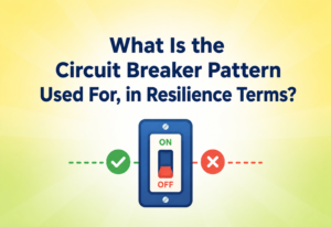
- Circuit breaker — a pattern where a service temporarily stops calling a failing dependency, giving it time to recover instead of piling on more failing requests.
- Graceful degradation — designing a system so that if one feature breaks, the rest of the app still mostly works (for example, if the “recommendation” service goes down, still show a plain feed instead of a blank screen).
Java example: a simple circuit breaker
public class SimpleCircuitBreaker {
    private int failureCount = 0;
    private final int threshold = 3;
    private boolean open = false;

    public boolean allowRequest() {
        return !open; // if open, we stop sending requests to protect the system
    }

    public void recordSuccess() {
        failureCount = 0;
        open = false;
    }

    public void recordFailure() {
        failureCount++;
        if (failureCount >= threshold) {
            open = true; // "trip" the breaker after too many failures
        }
    }
}
Explanation: Just as an electrical breaker in your house trips to stop a fire when too much current flows through the wires, this software breaker “trips open” after repeated failures — temporarily blocking further calls to a struggling service so it can recover in peace.
Security
Interviewers also watch whether you draw trust boundaries — the invisible lines that keep the outside world away from anything that should stay protected inside the system.
Interviewers pay attention to whether you draw trust boundaries — the invisible lines that separate what the outside world can touch from what should stay safely tucked away inside your system.
- What
- Authentication proves who you are (like showing an ID card). Authorisation decides what you are allowed to do (like checking whether your ticket admits you to the VIP section).
- Why
- Without both, anyone could pretend to be anyone, and even legitimate users could reach parts of the system they were never meant to touch.
- Where
- Login systems, API gateways, admin panels.
- Analogy
- Authentication is the bouncer checking your ID at the door. Authorisation is the same bouncer checking whether your wristband lets you into the rooftop lounge.
- Example
- Logging in proves you are “Alice” (authentication). The system then checks whether Alice is an admin before letting her delete another user’s post (authorisation).
Other security ideas worth drawing or mentioning
- Encryption in transit — data is scrambled while travelling over the network (HTTPS/TLS), so eavesdroppers cannot read it.
- Encryption at rest — data is scrambled while stored on disk, so a stolen hard drive reveals nothing useful.
- Rate limiting — capping how many requests one user or IP address can make, to prevent abuse and denial‑of‑service attacks.
- Least privilege — every component only gets the minimum permissions it actually needs, so a breach in one place cannot spread everywhere at once.
Monitoring, Logging & Metrics
A design is not truly finished the moment it goes live — someone has to know when it breaks. Observability is the umbrella term for the tools that let engineers see inside a running system.
A design is never really finished the instant it is deployed — someone has to know when it starts misbehaving. Observability is the umbrella term for the tools and habits that let engineers understand what is happening inside a running system in real time.
Think about a car’s dashboard. The speedometer is a metric (a single number tracked over time). The trip computer’s detailed record of everything that happened is a log. Following exactly which route the car took on a long road trip is a trace. And the “check engine” light flicking on is an alert.
Why mentioning this in an interview matters
Bringing up monitoring — even briefly, like “I would add health checks and dashboards to track error rate and latency” — signals that you think about a system across its entire life, not just the moment it is switched on. This is a very common differentiator between junior and senior‑level answers.
Deployment & Cloud
Modern systems live across several servers, data centres, or even continents. The global router sends each user to the nearest region, and each region runs a full working copy of the stack.
Modern systems are almost always deployed across several servers, data centres, or even continents, so that they stay fast and resilient for users everywhere.
Concepts worth naming
- Containers — a lightweight, portable package that bundles an app with everything it needs to run, so it behaves the same everywhere (like a shipping container that fits any truck, ship, or crane).
- Orchestration (e.g. Kubernetes) — software that automatically starts, stops, and restarts containers across many machines, keeping the desired number always running.
- CI/CD (Continuous Integration / Continuous Deployment) — automated pipelines that test and ship new code safely and frequently, instead of manually and rarely.
- Blue‑green deployment — running two identical environments (blue = current, green = new) and switching traffic across only after the new one is verified working, so rollback is instant if something goes wrong.
Databases, Caching & Load Balancing
Storage, speed, and traffic distribution — the three ingredients almost every big system leans on. Knowing when to pick which is where interview conversations go deep.
SQL vs. NoSQL
| SQL (Relational) | NoSQL (Non‑relational) | |
|---|---|---|
| Structure | Fixed tables with rows and columns | Flexible: documents, key‑value pairs, graphs, wide columns |
| Best for | Data with clear relationships (orders, payments, accounts) | Huge volumes of loosely structured or fast‑changing data |
| Examples | PostgreSQL, MySQL | MongoDB, Cassandra, DynamoDB |
| Analogy | A filing cabinet with labelled folders, same format every time | A junk drawer that can hold anything, organised loosely by category |
Cache invalidation
Caches speed things up, but they introduce a classic hard problem: what happens when the underlying data changes? If the cache still holds the old value, users see stale (outdated) information. That is why the famous engineering joke goes: “there are only two hard things in computer science — cache invalidation and naming things.”
- TTL
- Time‑To‑Live — automatically expire cached data after a set number of seconds or minutes.
- Write‑through
- Update the cache at the same moment you update the database, keeping the two perfectly in sync.
- Write‑behind
- Write to the cache immediately, and update the database in the background afterwards.
- Eviction
- When the cache is full, drop the least useful items (for example, the least recently used) to make room for new ones.
Java example: a simple LRU (Least Recently Used) cache
import java.util.LinkedHashMap;
import java.util.Map;

public class SimpleLRUCache<K, V> extends LinkedHashMap<K, V> {
    private final int capacity;

    public SimpleLRUCache(int capacity) {
        super(capacity, 0.75f, true); // "true" = order by access, not insertion
        this.capacity = capacity;
    }

    @Override
    protected boolean removeEldestEntry(Map.Entry<K, V> eldest) {
        // Automatically drop the oldest, least-recently-used item once full
        return size() > capacity;
    }
}
Explanation: Java’s built‑in LinkedHashMap can track access order. By overriding removeEldestEntry, the cache automatically discards the item that has not been used in the longest time whenever it gets full — which is essentially how a real production cache like Redis manages memory under the hood.
Sharding & consistent hashing
Sharding splits a database into smaller pieces (“shards”) across several machines. A common way to decide which shard owns which piece of data is consistent hashing — a technique that maps both servers and data onto a circle (a “hash ring”), so that adding or removing a single server only reshuffles a small fraction of the data instead of almost everything.
APIs & Microservices
An API is the agreed language between two pieces of software. A monolith bundles everything in one place; microservices split features into independently deployable services. Neither is universally better.
An API (Application Programming Interface) is a defined set of rules that lets one piece of software ask another piece of software to do something, without needing to know how the other piece works internally.
A restaurant menu is an API. You do not need to know how the kitchen cooks the pasta — you just need to know you can order “Spaghetti #4” and it will arrive at your table. The menu is the agreed‑upon interface between you (the client) and the kitchen (the service).
Monolith vs. microservices
A monolith bundles everything into one deployable unit — simpler to start with, but a bug in one feature can crash the whole app, and scaling means scaling everything together. Microservices split features into independently deployable services — more flexible and resilient, but adds real network complexity between services.
When to choose which
| Situation | Better Choice | Why |
|---|---|---|
| Small team, early‑stage start‑up | Monolith | Faster to build, easier to reason about, fewer moving parts to operate |
| Large organisation, many independent teams | Microservices | Teams can deploy independently without stepping on each other |
| One feature needs very different scaling than the rest | Microservices | Scale just that one service instead of the whole app |
A very common interview mistake is assuming microservices are always “better.” A senior answer explains the trade‑off and picks based on the situation — team size, scale needs, and organisational structure — rather than reaching for the trendiest option by default.
Design Patterns & Anti‑patterns (in Diagrams)
Just as code has good patterns and bad ones, diagrams themselves can be drawn well or badly. Three quick side‑by‑sides make the difference obvious.
Just as code has good patterns and bad “anti‑patterns,” diagrams themselves can be drawn well or poorly. Let’s compare, side by side.
Good Pattern · Layered, Labelled Flow
- Client → Gateway → Services → Storage, drawn left‑to‑right or top‑to‑bottom.
- Every box clearly labelled; every arrow shows the direction data flows.
Anti‑pattern · The Spaghetti Diagram
- Boxes scattered randomly, arrows crossing everywhere, no clear direction.
- Unlabelled lines make it impossible to follow, even if the underlying idea is correct.
Good Pattern · Progressive Detail
- Start with four to six big boxes, get agreement on the shape.
- Only zoom into one area (like the database) once the interviewer asks or it clearly matters.
Anti‑pattern · Premature Detail
- Spending the first ten minutes drawing exact database column names.
- Doing it all before you have agreed on what the system even needs to do.
Good Pattern · Narrated Drawing
- Speaking while drawing: “I will add a cache here because reads will vastly outnumber writes for a news feed.”
- Every box arrives with a short reason attached.
Anti‑pattern · Silent Drawing
- Drawing quietly for two minutes with no explanation at all.
- Leaves the interviewer unsure of your reasoning, which is exactly what the diagram was meant to prevent.
Common software anti‑patterns worth avoiding — and drawing around
- Single Point of Failure (SPOF) — one component that, if it fails, brings the whole system down. Good diagrams show redundancy to remove these.
- God Service — one microservice that does far too much, defeating the entire reason you split the services apart in the first place.
- Chatty Services — services that call each other endlessly for tiny pieces of data, creating slow, fragile chains of network calls.
Best Practices & Common Mistakes
A short, practical checklist of habits that consistently produce the best interview diagrams — plus the mistakes that quietly sink otherwise strong candidates.

Best practices for drawing in an interview
Common mistakes to avoid
- Jumping straight into code instead of the overall design.
- Designing for only a hundred users when the interviewer explicitly said “millions.”
- Forgetting to mention what happens when something fails.
- Adding buzzwords (like “Kubernetes,” “Kafka,” “microservices”) without explaining why they are needed for this specific problem.
- Never asking a single clarifying question before diving in.
- Running out of time because too much of it was spent perfecting one small section.
A messy diagram paired with a clear, spoken explanation almost always scores better than a beautiful diagram drawn in silence.
Real‑World & Industry Examples
Diagrams are not just an interview ritual. They are the daily shared source of truth at Netflix, Uber, Amazon, and Google — simplified here for learning.
Let’s connect all of the above to how real companies think about diagrams and architecture — simplified for learning purposes.
Netflix
Netflix is famous for pioneering the microservices approach at massive scale, along with the idea of intentionally causing failures in production (called Chaos Engineering, run through a tool named Chaos Monkey) to make sure the system can survive real failures. Their engineers constantly draw and update architecture diagrams because with hundreds of microservices, no single engineer can hold the entire system in their head — the diagram becomes the shared source of truth for whole teams.
Uber
Uber’s system has to match riders and drivers in real time across cities worldwide. Their engineers rely heavily on geographic sharding (splitting data by city or region) and heavy use of message queues to soak up spikes — for example, when a concert ends and thousands of ride requests appear within seconds. Diagrams help Uber engineers reason about how to keep local matching fast while still recording every trip centrally for billing and safety.
Amazon
Amazon popularised the idea of “two‑pizza teams” — teams small enough to be fed by two pizzas — where each team owns one service end‑to‑end. That model only works because every team can draw a clear diagram of their service’s boundaries: what it owns, what it depends on, and what depends on it. Amazon also popularised a practice called “working backwards,” writing the press release and FAQ before building anything, but the architecture diagram remains the technical backbone that turns that vision into a workable plan.
Google’s scale requires extreme automation, and its internal culture emphasises design documents that always include diagrams, reviewed by other senior engineers before a single line of code is written. This process, essentially a mini version of a system design interview, catches expensive mistakes on paper rather than in production.
FAQ, Summary & Key Takeaways
Answers to the questions candidates ask most often about system design diagrams — and the seven ideas most worth carrying with you into any interview.
No. A physical whiteboard, a shared virtual whiteboard tool, or even plain text boxes drawn with a mouse are all perfectly fine. Interviewers care about clarity of thought, not artistic skill.
There is no single correct answer. Interviewers evaluate your reasoning process, your trade‑off awareness, and your ability to adapt the design as requirements change — not whether you memorised any particular company’s real internal architecture.
Start broad. Add detail only where the interviewer shows interest, or where you personally believe a decision is especially important (like choosing between SQL and NoSQL for a specific piece of data).
Yes, and it is actually a positive signal. It shows you can revise your thinking when new information arrives, which is exactly what real engineering work looks like.
Understanding the underlying building blocks (caching, load balancing, replication, queues) matters far more than memorising any fixed diagram, because interviewers will always add a twist that a memorised answer cannot handle.
Key Takeaways
- Interviewers ask for diagrams because human memory and spoken language alone cannot hold a complex system clearly — a diagram is shared, precise, external memory.
- The diagram is a window into your thinking: the order you draw things, the questions you ask first, and how you revise, all matter more than the final picture.
- Always clarify requirements before drawing, start high‑level, then add detail progressively.
- Narrate your reasoning out loud while you draw — silence defeats the entire purpose of the diagram.
- Show awareness of trade‑offs (CAP theorem, SQL vs. NoSQL, monolith vs. microservices) rather than claiming one “correct” answer.
- Cover the full lifecycle of a system: normal operation, scaling, failure, security, and observability — not just the happy path.
- Real companies like Netflix, Uber, Amazon, and Google rely on diagrams daily, not just in interviews, because complex systems cannot be safely built or changed without a shared visual plan.